At first, Butler Branding’s graphic designer, Christopher Orozco, wasn’t super keen to sit down and chat design with me. He feared he might not be the best interviewee, and even after the interview went swimmingly, he felt compelled to send me an article on why introverts sometimes struggle to translate their thoughts into words.
I, however, had a blast interviewing Chris, and learning about not only his own personal history, but the history of graphic design. If you’re in for discussions of ancient handprints, fourth grade dinosaur doodles, and how using Photoshop compares to eating spaghetti with a spoon, you’ll want to read on. (Note that this interview has been edited for clarity and length.)
ML: We can go wherever you want as part of this, but to start, I’m most interested in picking your brain about graphic design, specifically. What’s the most interesting thing you’ve looked at, read, or watched recently about graphic design?
CO: Do you follow any design blogs?
ML: (laughs) No, not really.
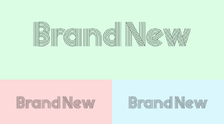
CO: So Brand New is one of the ones I look at. You can see there that they’re looking at some typography that’s very experimental stuff. So basically stuff like that …

ML: So when you read one of these posts, what are they usually talking about, and what are you looking for?
CO: Well this guy usually just criticizes what other brands do.
ML: Is it constructive criticism?
CO: Yeah, they give pretty constructive criticism. Basically, I want to see things that haven’t been done before. I want to look at new stuff, really.
ML: So you’d send me to Brand New; what other sites or blogs would you send me to if I wanted to start reading about design?
CO: Design Observer is another one I like. They talk about anything that’s going on in contemporary design. They also have a podcast. I don’t always have time to read them all, but I’ll quickly glance through them.
ML: About how much time a week do you think you spend looking at design blogs and other stuff like this?
CO: I check them every morning, but I’m mostly looking at headlines and maybe skimming a few paragraphs.
ML: So say a client comes to us and tells us we can reinvent their brand from the ground up. What influences the direction you’re going to take that design, at least to start with?
CO: The first thing I do is obviously to look at the competition and see what’s been done before. So say for [recent Butler client] SolarTrueUp, I opened up the brand strategy document that Sean provided and found the section that talks about competitors. Then I went and Googled them to see what those companies were doing.
I try to mimic those styles but, at the same time, differentiate our client so that they stand out.
ML: When you’re looking for stuff to mimic, what are the elements you’re most looking to pull from? Is there a set hierarchy of you saying, “Okay, I’m going to look at the typography, and then the colors, and then I’m going to go a different way here …”
CO: A lot of it is just off the cuff. Just whatever’s in my mind, that’s what I’ll start going with.
ML: How many competitors do you usually look at?
CO: Two or three. Just enough to get a taste of the industry.
As an example of how that works, I know the client mentioned something about really liking bright color. Color was big for them. Looking at their competitors, I saw that oranges and yellows were pretty much played out. So for SolarTrueUp, I decided to go with purple.
ML: Was there a thematic choice behind that, or was it just that you knew this was a color that would set them apart from their competitors?
CO: Sometimes I do use color psychology to make those choices. There are a lot of articles about how different colors influence customers. But usually, I’ll just start by going with something that I know hasn’t been used yet.
ML: So what other information do you need before you start in on a big branding project? What else are you looking for in that brand strategy document?
CO: Can you pull up the document actually? I’m sorry; I’m a very visual person.
ML: That makes sense. (laughs, opens the document) Part of the reason I ask is self-interest. I’m one of the people who needs to make sure you have the information you need to get going and do your job.
CO: Honestly, I require very little information. I just design as simply as I can, and it’s been working all this time. It’s not even a secret formula – just whatever I think looks good, I go with.
ML: How long have you been doing this at this point? I feel like I must have asked you this before.
CO: I don’t think you have, actually. I’ve been a graphic designer since 2012. I took a design class in high school, but I didn’t really see myself doing that long term. So I went to Fresno City College and took a bunch of random classes – electrical classes, art classes. Finally, I landed on design and found out I was pretty good at it.
(looks at the document) Honestly, if I didn’t have this brand strategy, I could still do the design. But it does help. Maybe that’s not the way it should be done, but it’s been working for me all this time.
ML: I know you prefer big branding projects to the “nitty-gritty” design work we get into after those projects are finished. What speaks to you about the branding projects?
CO: The creativity of them. There’re so many ways you can create a brand or build it. I love building brands, and building things in general.
ML: So we do roughly three stylescapes per rebranding project, right? We do a mild, a medium, and a spicy take. Given unlimited time, how many stylescapes would you produce for a project?
CO: If it was up to me?
ML: Yeah.
CO: One.
ML: Just one?
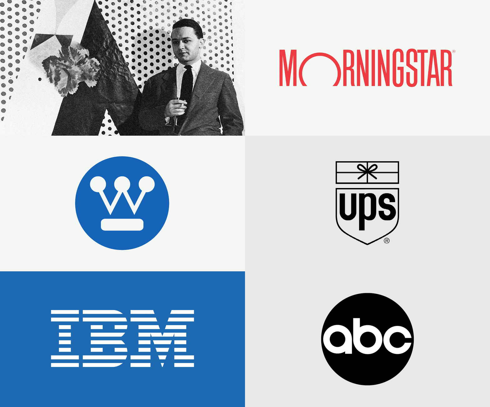
CO: Yeah. Yeah! There was this designer, Paul Rand. Are you familiar with him?

ML: No. (Editor’s Note: I am now. Thanks, Google.)
CO: Well, clients would ask him to make three, four, five different concepts. And he’d just say, “No, I’m gonna do one. And if you like it, pay me. And if not, feel free to go find someone else.”
Now, I’m not saying that’s the right way to go – but the designer knows what he’s doing, and that’s what he thinks is the solution. So if you provide four, five, or six concepts, are you just watering it down?
ML: So I’m processing this … for some reason I thought you were gonna say fifty or some other high number. Because you’d get to spend more time exploring the brand.
But when you say one, it totally makes sense to me. Because when I write something, I just want to write it once. In that, in a perfect world, I would find that one perfect take, and we’d use that.
CO: You’re really good at that, actually. You provide four to five headlines for ads and things like that. If it were up to you, you’d just suggest one?
ML: So I know how this business works, and I know that the take I like the most won’t necessarily be the one that a client likes the most. That’s just how it works. It’s neither good or bad. So I try to call out, “This is what I would pick and why,” but also provide a couple different takes that work a little bit differently.
CO: So I mean, that’s in an ideal world, that I would provide just one comp. Obviously we’re not there, and I’m not Paul Rand.
ML: Even in that Chip Kidd TED Talk that I sent you the other week, typically he was showing off only one design, too. For the most part, it seemed like when he hit upon an idea he liked, that was the idea.
CO: At the same time, I know you’re not supposed to be married to one idea. So providing various options is good.
ML: It’s a tough battle, especially when you think you nailed it on the first try and there are other things you could move on to.
CO: Sometimes I feel like I create designs that are not ready to be accepted by the client.
ML: Yeah, we always do those three takes with various degrees of “spiciness.” And mild is the safest one.
CO: And typically that’s the one that clients go for.
ML: Whereas the spicy one is often the one we would pick if it was up to us.
So I’m always shopping around for different writers or other creatives that I’m borrowing stuff from. Who are the designers you’re looking at and trying to incorporate aspects of their work into your own?
CO: Lance Wyman is one. He did the identity system for the 1968 Summer Olympics. Which was a huge, huge project. A massive undertaking that dealt with identity work, signage, directional signage. Obviously that stuff’s very old, but I think it’s still very relevant in the way he approached it.

David Carson‘s another one, a very experimental typographer.
ML: How so?
CO: In the way he’s cutting type up, warping it, playing with contrast and size. Stuff like that.
ML: When he’s doing these experimental things with the typography, where do they show up? Are they in ads, or on book covers …
CO: Usually print. And again, a lot of this stuff wouldn’t apply to our work, but they’re things that I can pull from. They’re pieces of acquired knowledge that I hold on to, and when I’m working on something, sometimes I’ll just retrieve it. In a way, it’s a combination of things that I’ve picked up over the years.
ML: What are the things you’re trying to improve on right now? Is there a skill or even a style that you’re trying to refine?
CO: I’ve been trying to get into animation. Does that count?
ML: Absolutely it does.
CO: I’ve been trying to learn Adobe After Effects. Because I think I’m pretty good at type, but if I could animate it, I think that would make my work that much better.
ML: So what sort of stuff would you use that in?
CO: Branding projects, logo reveals, stuff like that.
ML: What made you want to get into that?
CO: Just trying to do something that’s not in my comfort zone, you know. It’s slow progress so far … and web, that’s another thing that I think I’m not as good at as I want to be. But for sure I want to get into that more.
ML: When you say web, what do you mean?
CO: Website design, home page design, stuff like that.
ML: I know we’ve had you working on some of those, but kind of intermittently, right?
CO: Yeah, and sometimes our programs don’t match. David likes to work in Photoshop, and I like to work in InDesign, so there’s a kind of clash in programs, you could say.
ML: So how do we overcome that?
CO: Someone has to choose! (laughs) I’m super slow in Photoshop, that’s why I prefer not to work there …
ML: So okay, here’s my question, then: Is one better than the other? Or is it straight-up just different people like different programs?
CO: I like to use the analogy of eating spaghetti. You can eat spaghetti with either a fork or a spoon.
ML: Chris, no you can’t. Why would you ever eat spaghetti with a spoon?
CO: Exactly! So why would you ever work on things in Photoshop? That’s what I’m trying to say.

No, but there are some projects you can work on in either program. But InDesign is more efficient for sure.
ML: What specifically makes you recommend InDesign?
CO: So InDesign is definitely better for page layout. Because it deals with Photoshop elements and Illustrator elements all at once, so you can combine those two things and get the best of both worlds. And this is for basically everything: posters, flyers, business cards, websites. Everything.
The only thing I use Photoshop for is image correction. That’s pretty much it. And that’s the only thing it should be used for.
ML: So then, because I dabble in graphic design – in that I have to get you the information you need and, if you’re really busy, I’ll sometimes take care of really minor stuff myself – I’m interested in asking you, where would I start as a novice graphic designer?
CO: Photoshop.
ML: (laughs)
CO: No, really, that’s where everyone begins. That’s where I began. I was building business cards.
It’s an easier program to learn, that’s why a lot of beginning designers start there. It’s a more intuitive program. But eventually you would have to work yourself up to Illustrator and then InDesign.
ML: So would you recommend that I just bite the bullet and start by learning InDesign?
CO: A lot of people who do that give up. That happened to a lot of my classmates at Fresno State. They started off in InDesign, and the learning curve was too much. Those classes were more theory, so the professors expected you to know the programs already. But some didn’t know any program, so they had to start somewhere.
ML: Irregardless of what software you’d use, where would you start me when it comes to learning graphic design theory or what I need to know to even start designing correctly?
CO: Basically, the elements of design and the five principles of design. Are you aware of those?
ML: No; name ’em out.
CO: Can we look them up?
ML: No, that’s cheating. It’s a test.
CO: Okay – so the elements are line, shape, value, color, and texture. And the principles, some are repetition, harmony, proximity, contrast. That’s a good enough list to start.
ML: Yeah, I was just testing you because I’m mean. So if those are the things I need to learn about, where should I go to do that?
CO: I would start with the books. Learn the history of design, and that way you can appreciate what’s been done before and how we got to where we are now.
The standard book is The History of Graphic Design by Philip Meggs.
ML: Where does that book start? What’s the first entry in the history of graphic design?
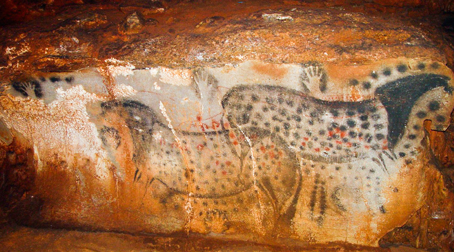
CO: It’s from 38,000 or 28,000 years ago, these paintings in Lascaux, France. They’re handprints, and that’s the beginning of visual communication, believe it or not. Then it goes on to the Babylonians, the Egyptians, you know everything that’s next after that …

ML: We’ve looked at and talked about so many bits and pieces of design during this interview. How do you hold all that in your head? Or how much do you even refer to it consciously while you’re designing, and how much do you not?
CO: I’m not sure. That’s a good question.
ML: I like that answer, because it’s an honest answer. I would probably tell you roughly the same thing, if you asked me about writing. Sometimes I’m very cognizant of lessons I’ve learned from specific professors, or writing newspaper articles, or technical writing –
CO: So you’re saying you do utilize specific pieces of what you’ve learned, consciously?
ML: Yeah, there are problems where I’ll look at them and see, oh, this thing I learned or used previously will solve it. Like for one of our clients, I revamped a few of their recipe blog posts. When I was doing that, I was specifically writing like a technical writer, because that step-by-step structure solved that problem.
CO: And I’m sure I have examples like that, but I tend to blank out in situations like this. I’m bad at thinking of those sorts of things on the fly.
ML: No worries. So what did you hope I would ask you that I didn’t?
CO: What made me get started in design in the first place. Basically, art was the reason. Back in third or fourth grade, I was drawing this little dinosaur character and this classmate of mine was looking over my shoulder and complemented it.
I’m sure it was a really bad drawing, but to her it was good. Ever since then, that’s pushed me toward the art world. It led me to art, and I tried to refine my skill. And art led me to design.
ML: What made you want to jump from “art as art” to design? Because they’re semi-different things, right? In that graphic design is a bit more “practical” (and I’m sure we’ll get comments for that) …
CO: What it was, was the ability to solve other people’s problems instead of my own problems. Which is art, right? The artist is creating work for themselves. Whereas with design, you’re solving other people’s problems.
And that’s what I like to call myself, is a visual problem solver.


