Why present, instead of email?
I never email logo concepts to clients without first presenting the concepts. Live presentations (whether in person or via ZOOM) are critical for several reasons:
- It gives you the chance to explain the logic and insights that drove your creative decisions
- It allows you to educate the client while presenting (most clients need guidance on what makes for a good, and consequently a bad logo)
- It helps build rapport with the client and stakeholders
- It reassures the client that the design concepts are not random expressions of your subjective preference
- It allows you to show the concepts in the order and manner you choose
- It enables you to gauge the temperature of the room and gain feedback in real time
- It gives you the chance to defend your design decisions when met with pushback, if needed
Build your design vocabulary
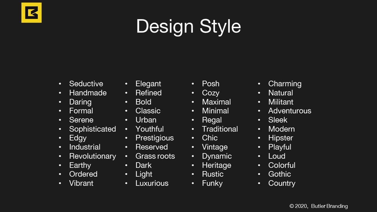
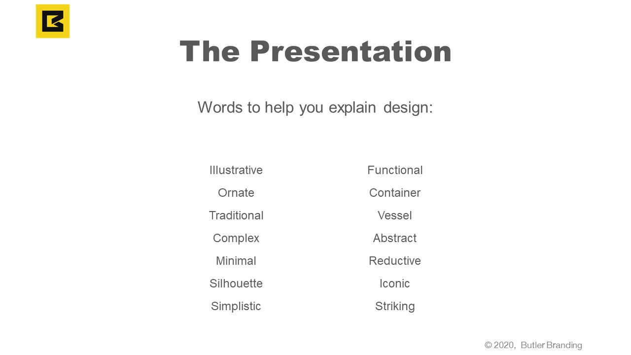
A huge part of the presentation is the designer’s ability to articulate the design direction, the decisions made, the style of design, and the usage for the logo. Reading books, forums, reviews, and blogs about design will help build our design literacy.
The Presentation Flow
Every time I present logo concepts to clients, I follow the same general flow of presentation.
Step 1) Pre-Framing
Pre-framing is a tactic of preparing your clients frame of mind before you show them your logo concepts. Before revealing the logo concepts, I like to remind the client of two things:
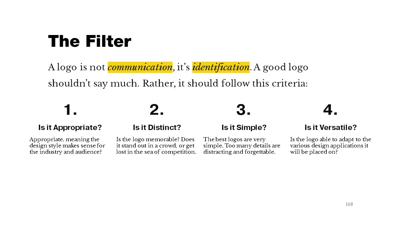
1. What a logo is. A logo is not communication, it is identification. It shouldn’t try to say a whole lot. It is best to think of a logo as an empty vessel that meaning can be breathed into over time, with consistency of use and follow through on the brand’s promise. When you try to communicate too much with a logo, it becomes too busy and distracting. Helping clients understand this will answer the notorious question/objection before it comes – “I don’t get it? What does it mean?”.
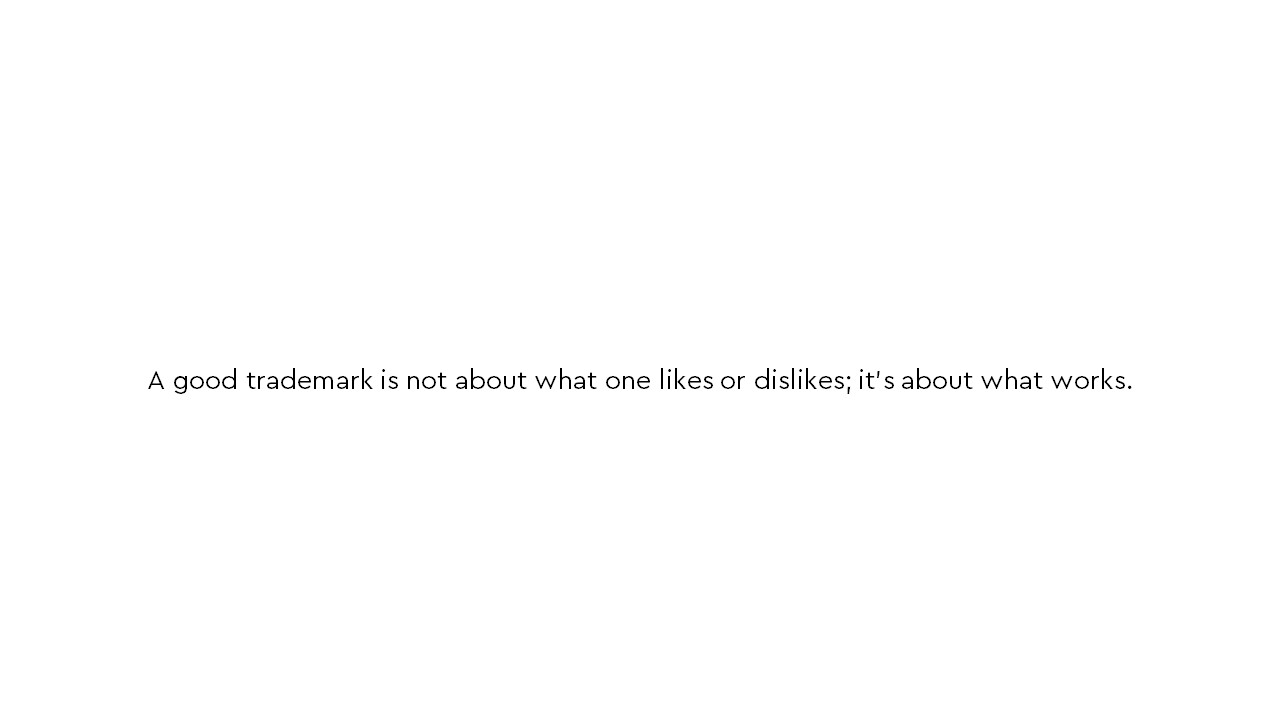
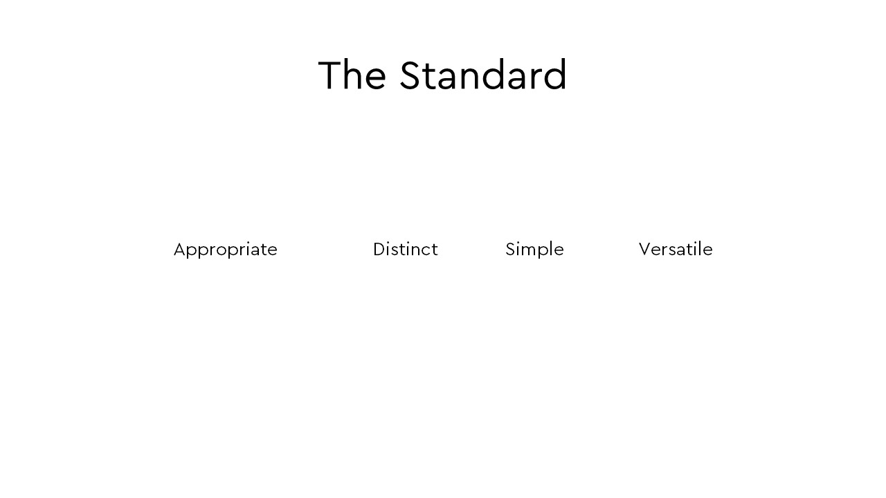
2. How we define good (and bad) design. Logo design has a bit of subjectivity to it. Who is the standard for what good and bad design is? When we see a good logo it’s difficult to explain why it’s good. We just kind of know it when we see it. Same goes for bad design. However, it’s not as arbitrary as you might think. There are some basic rules for what constitutes a good and bad logo. During Discovery I like to share a short video from the Futur featuring Sagi Haviv regarding the 3 rules to a good logo (I add a fourth rule). At the beginning of the logo reveal presentation, I remind them of the rules which, for us, act as the filter through which we determine what designs would work for their project.
Pre-framing takes only about 1-2 minutes, and I show them these two slides…
Step 2) Objectives and Strategy
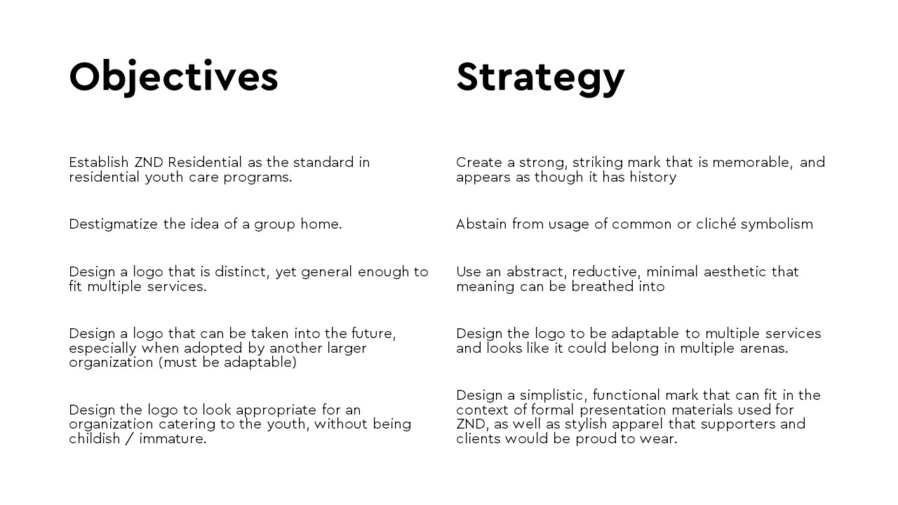
Now that the ground is laid and the client is aware of what to expect for the logo presentation, I remind them of our objectives for designing the logo, and the strategy we took to accomplish their objectives.
Objectives need to come from the client – not the designer. It’s important for the designer to understand the client’s need for a logo design or logo redesign, and the need must be deeper than aesthetic preference. Objectives are uncovered during Discovery. Maybe they are trying to tap into a new market. Maybe their logo isn’t able to move with them into the future. Maybe there have been organizational changes and they want to communicate change through a fresh identity. Reviewing objectives not only reassures the client that you understood the problem to solve, it also removes their design preference from the equation. Most clients are willing to settle on a logo they don’t personally like, so long as the designer can clearly articulate why the logo meets their business objectives.
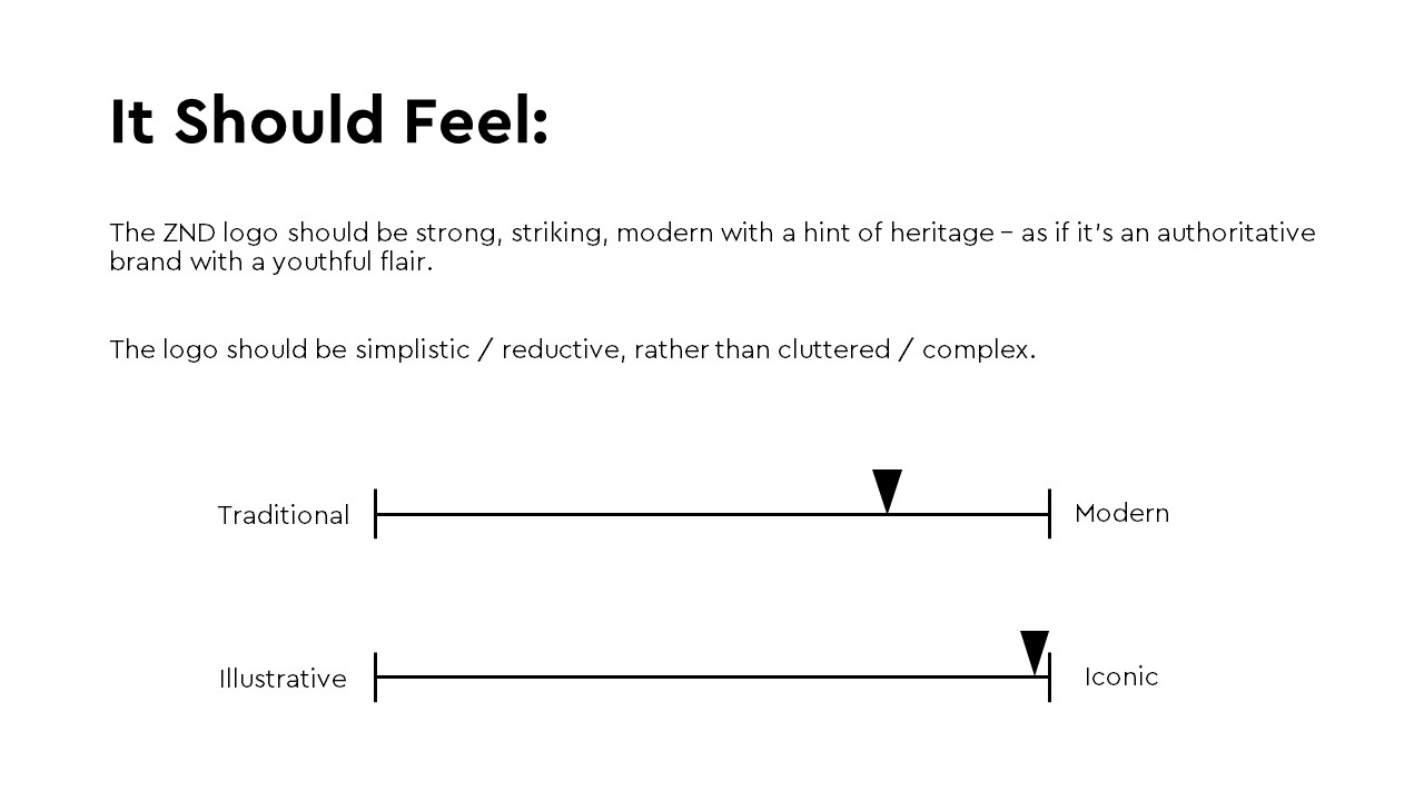
Strategy needs to come from the designer – not the client. Once I restate the client’s objectives for the logo design, I inform them of the strategy we took to accomplish their objectives. I inform them with words, first – then showing them how those words are expressed through the concepts we created. It’s critical to build the case for your strategy before you show the execution.
(Example from an actual presentation)
Step 3) Review Insights from Discovery
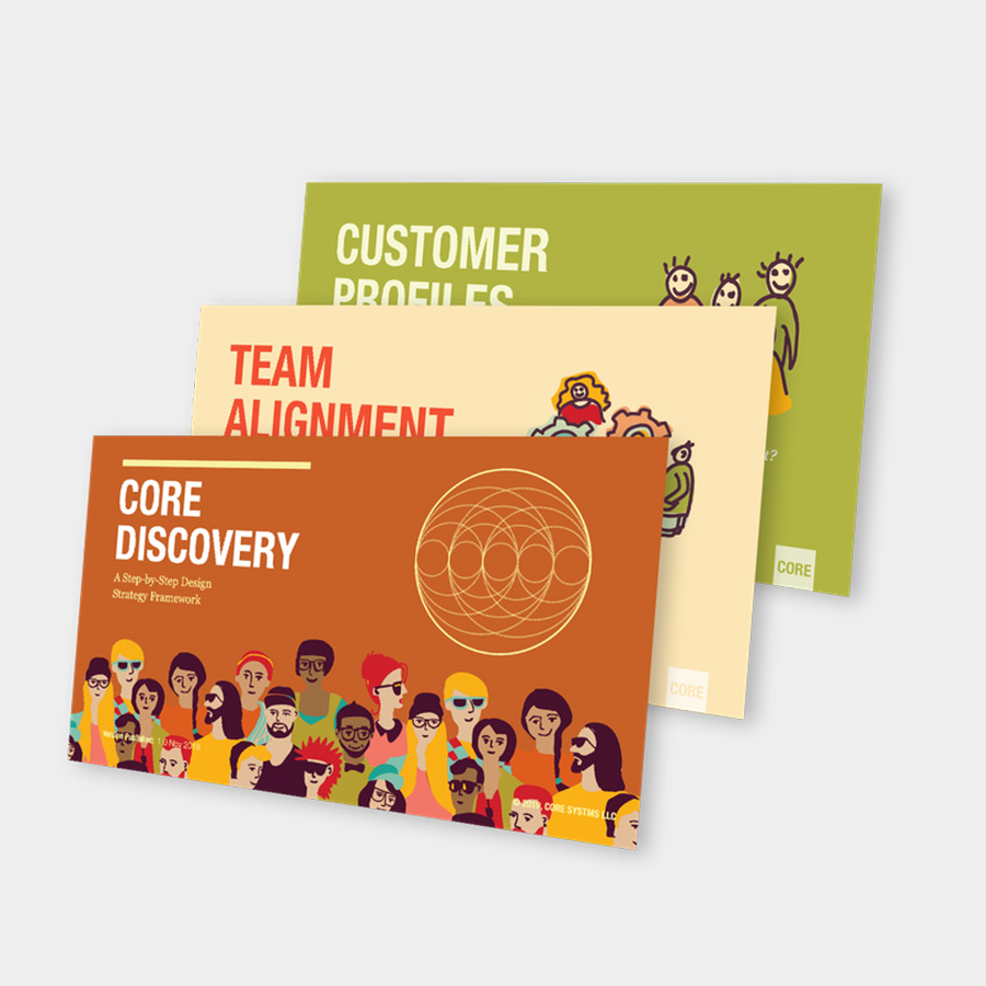
The logo concepts we come up with are a byproduct of the strategy we develop. The strategy we develop is the byproduct of the Discovery session. Discovery is a facilitated meeting lead by the designer for the purpose of uncovering insights that will inform the creative team on what and how to design.
The last step before revealing the logo concepts is to remind the client of the insights they gave you during Discovery. This reaffirms the fact that the logo concepts are just as much from them as they are from you. It gives the client a sense of ownership of the concepts since their insights are what drove your decisions.
Step 4) Reveal the Logos
Show only three logos. Even though during the creative process we may sketch or work on dozens of logo concepts, we typically only reveal up to three and no more. Showing too many concepts can be overwhelming and cause paralysis, making it more difficult for the client to choose. It also cheapens the design for each concept you show. When you narrow down your concepts to three, it reinforces the idea that these are the top three strongest choices.
Show one logo at a time. Instead of showing all the concepts together on one image, I focus on building a single case for each concept. Showing one logo at a time helps the client focus on the logic and the story, rather than their personal preference. If you start by showing them multiple concepts at once, their eye might naturally be drawn to the one of their personal preference – hindering them from hearing the case and logic for each logo.
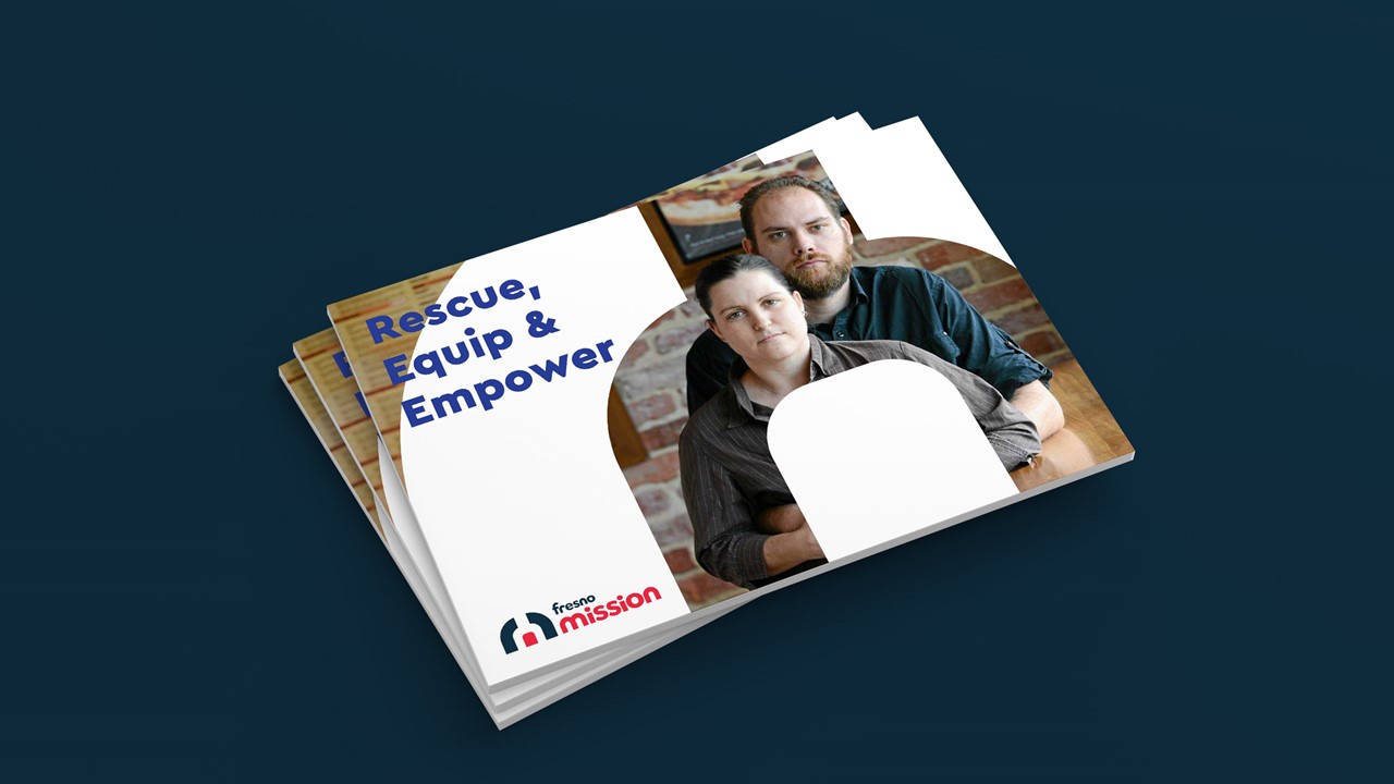
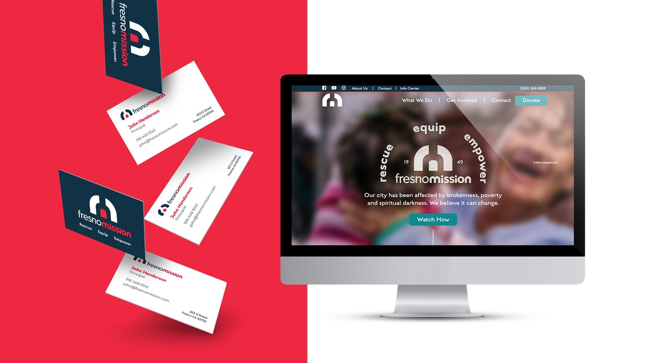
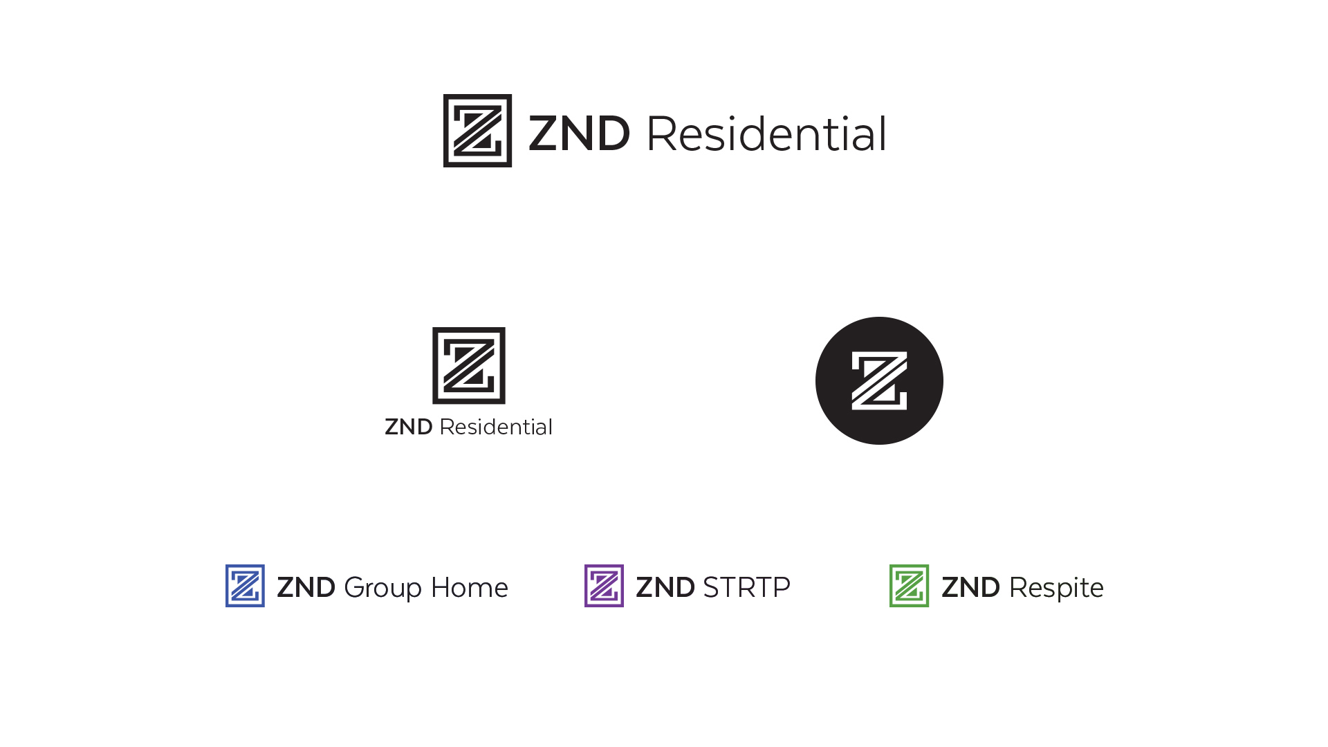
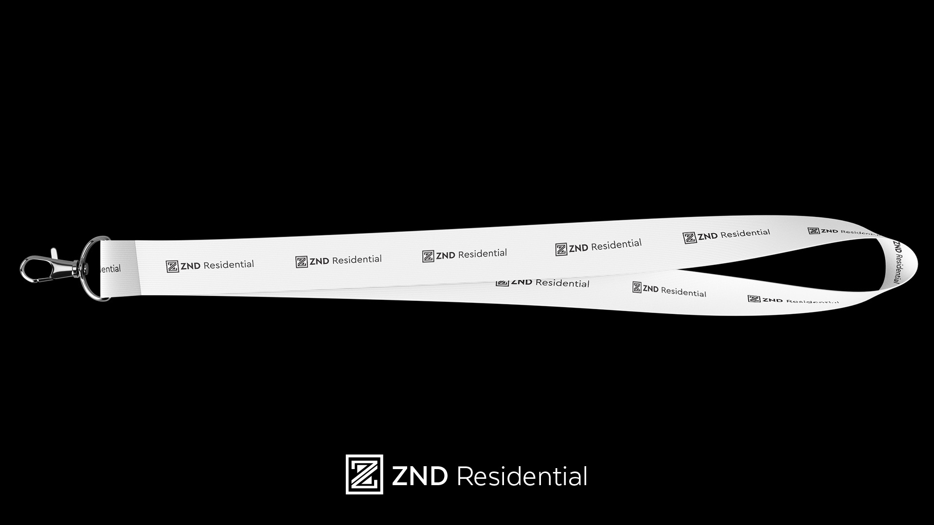
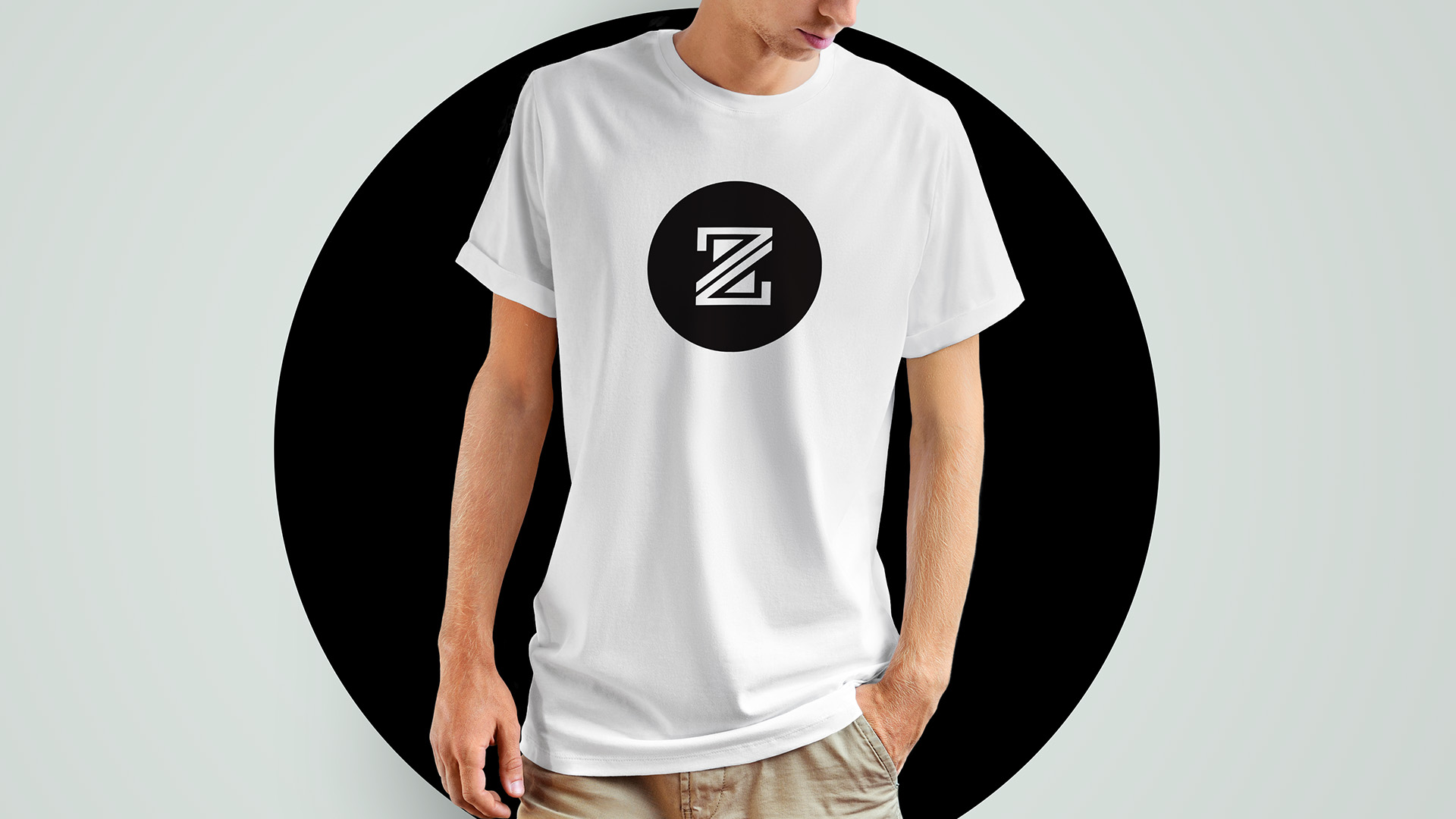
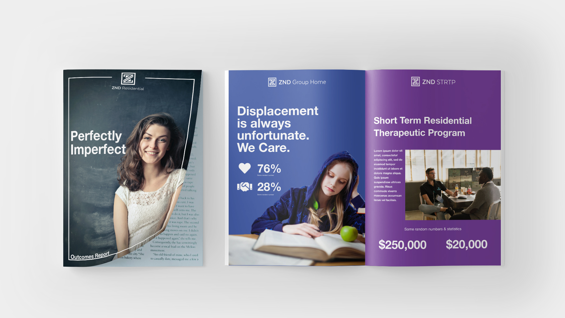
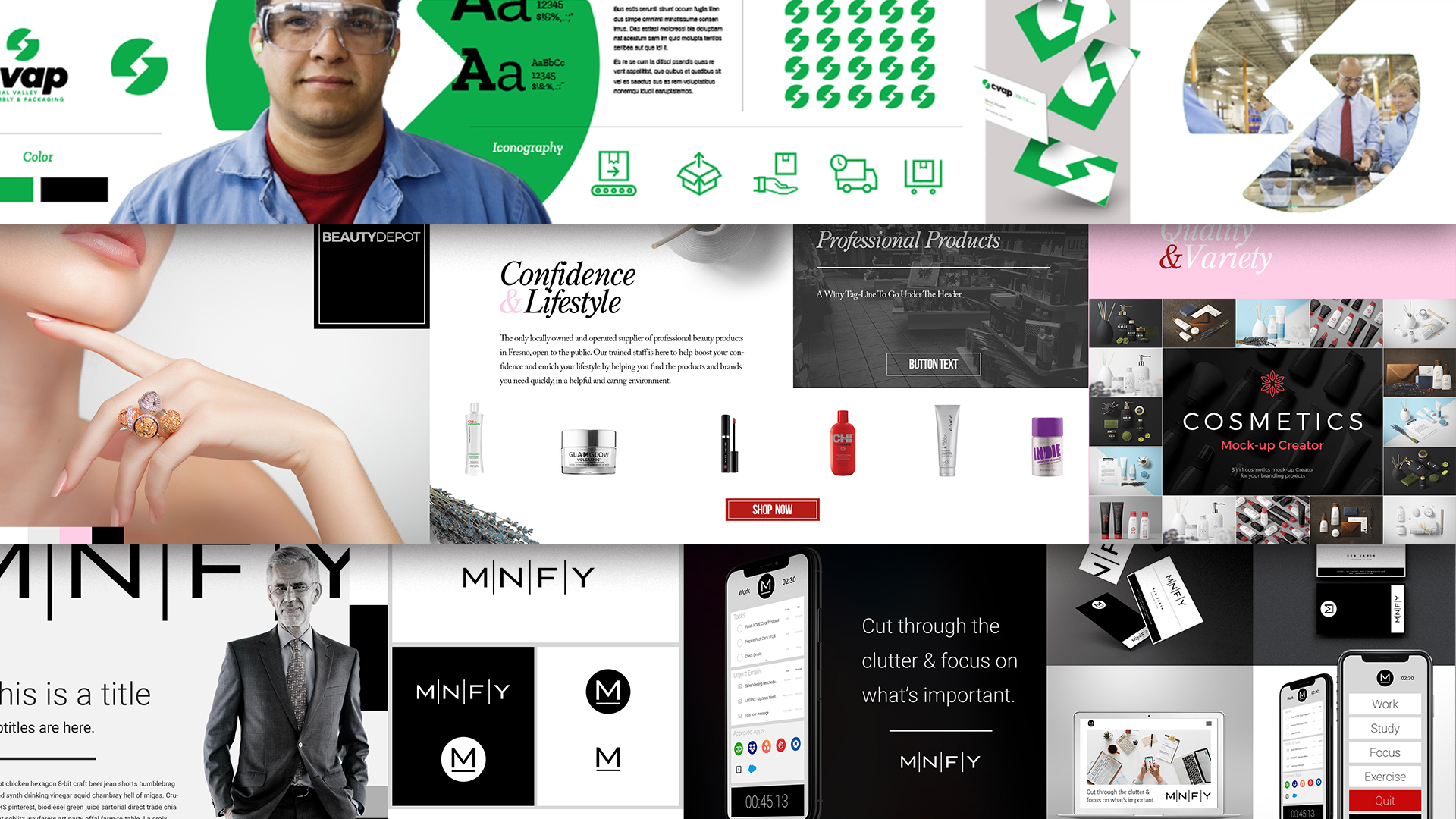
Show the logo in context. In everyday life, you never see a logo by itself on a clean white background with no other distractions or surrounding elements. You always see a logo in context of something it’s placed on. During Discovery its important to identify what context the logo will be used in, then show the logo concept in those contexts. It changes a design when you see it on an application rather than on a simple white background. Remove as much guesswork as you can, filling in the mental gaps your client will have when they see your concepts.
(From the ZND Residential Example)


(Other Samples)
Step 5) Gain Feedback
After you reveal your concepts, building a case for each logo, ask your client to share their initial thoughts. “What are you thinking? How are you feeling? Which one feels right, based on the objectives and strategy?”
Don’t put pressure on the client to make a final decision on the spot. Reassure them that they will have time to make their determination (how long depends on how you structure your timeline). However, gaining their initial feedback during the time of the presentation is important. Document what they say by writing notes on each concept they comment on.
In my opinion, the more people in the room during the presentation the better. With more people it is easier to gauge consensus as people start to speak up. They will collectively start building a case for the popular choice, and landing on a decision will be quick. When there are only one or two other people in the room, there tends to be a bit more hesitation because they do not want to make a wrong decision. People thrive off confirmation, which is why you’ll hear “I love the concepts. Send me the samples and let me think about it over the weekend” (AKA – let me show a bunch of people and get a vote). Larger companies know better than to get cheap opinions from non-professionals – especially those who weren’t present for the Discovery session and have no insights into the strategy. However, even if this does happen, so long as you have done a good job articulating your case for each logo and demonstrating how the concepts are a direct result of their objectives, a few outside opinions won’t hurt. It is extremely rare when a client is unhappy with any of the concepts and asks for another one when you present well.
In Summary
- Never email logo concepts, always do live presentations.
- Develop your design vocabulary so you can effectively articulate your concepts.
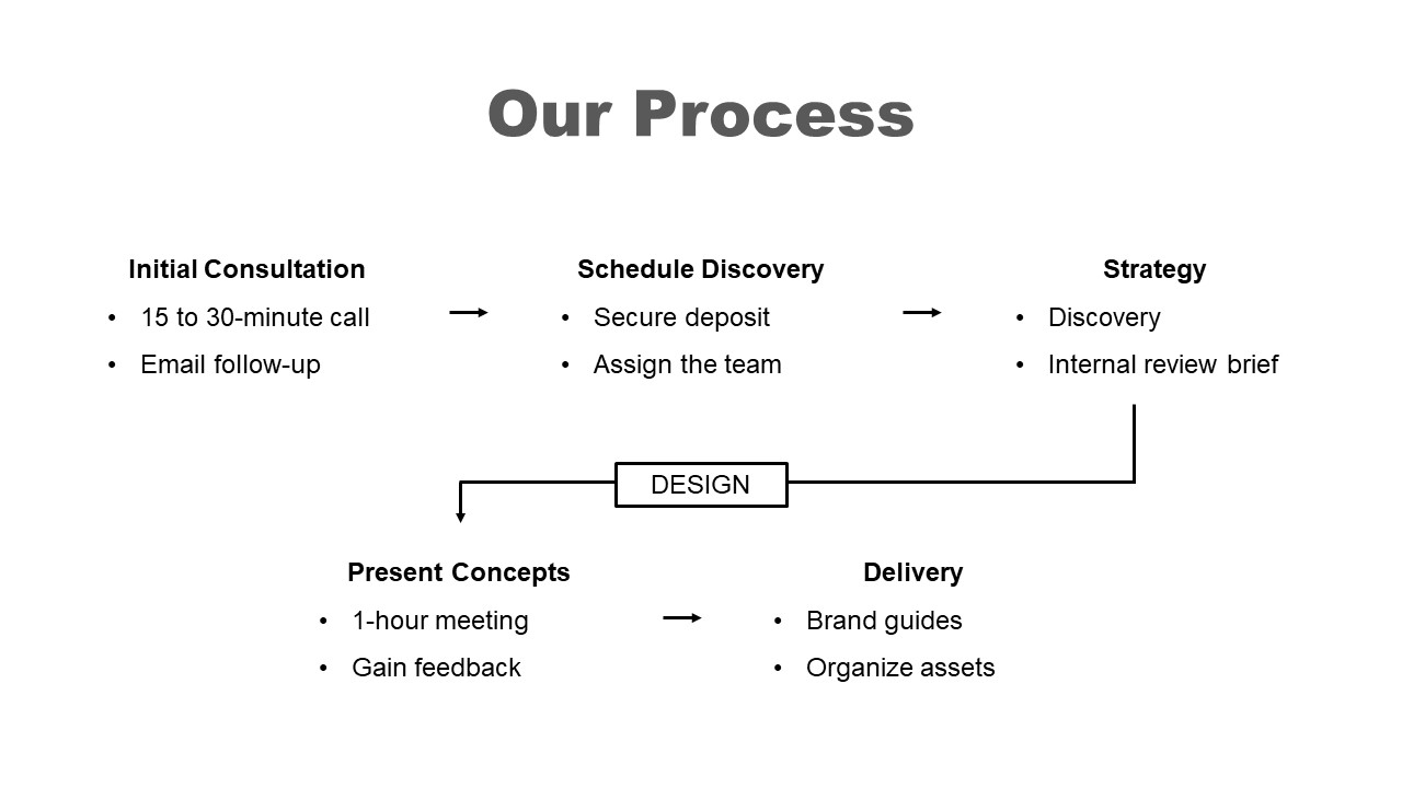
- Follow a structured flow for your presentation
- Pre-frame your client’s mindset before the reveal
- Remind them of the objectives and inform them of your strategy
- Review the insights from Discovery that informed your design decisions
- Reveal the logo concepts. No more than three, one at a time, and in context.
- Gain feedback

