UX Design Strategy
In a recent post I explained what UX Design is and why it’s important. I gave a peak at what a UX designer does, as well as discuss some of the benefits of incorporating UX design strategy into your business. While that post explained a lot of the “what” of UX design, this post is designed to dive a little deeper into the “how”. As stated in the above mentioned post, UX design is both a science and an art. Here we’ll discuss the science aspect of UX design. This is what’s commonly referred to as UX Design Strategy.
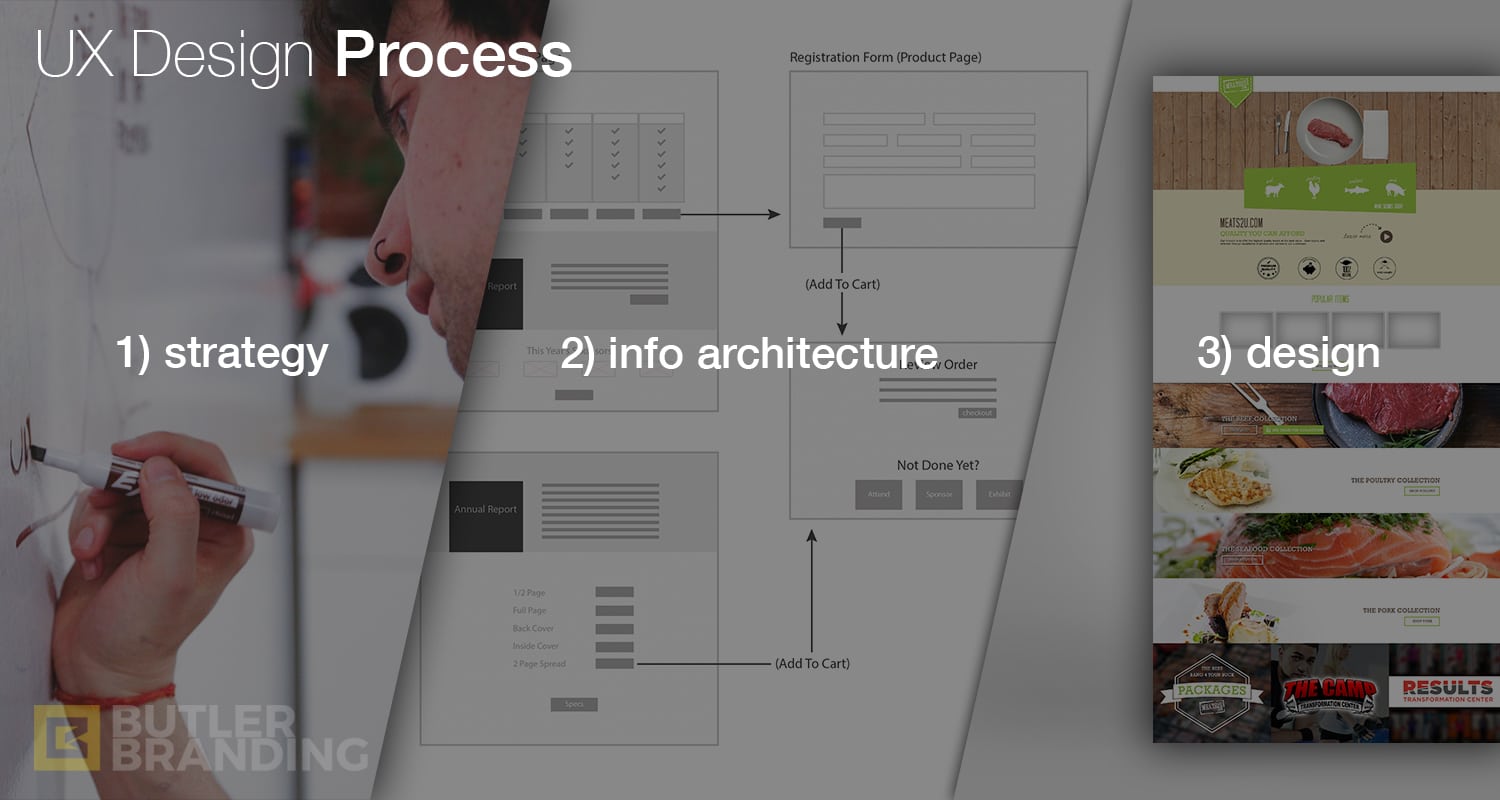
UX Design Strategy is the process of uncovering the priorities and requirements needed in a design in order to improve the user’s experience. UX strategy is the preliminary step taken before information architecture and design. UX Design can be broken up into three basic steps:
- UX Strategy – uncovering the priorities, requirements and content needed for a design by focusing solely on the user
- Information Architecture – determining an easily digestible and pleasurable layout to display the content in a way that appeals to the user (this can be done in the form of a simple wireframe)
- Design – putting the aesthetic touches to the layout in a way that is authentic to the brand, and appealing to the user
Below is a 6 step process that we at Butler have found to work for us. It is by no means a one-size-fits-all process. What works for us may not work for you. I suggest reading this with an open mind, incorporating what makes sense for you, and tweaking where necessary. The steps are:
- Preliminary Brainstorm
- User Stories
- Competitive Audit
- Prioritization
- Requirements List
- Information Architecture
(The final step is the actual design)
1) Preliminary Brainstorm
This is a simple brainstorming session that we have with our clients where we ask some really basic questions about the brand and the users. We get a 30,000 foot view of the company and answer questions like:
- Who is our target market?
- Who else do we do business with? (Vendors, partners, distributors, affiliates, etc.… these, too, are users)
- What would they expect to find and interact with when interacting with our brand?
- What would we want them to see, that they may not have expected?
- What actions do we want them to take?
Most of the time the preliminary brainstorm session is the first meeting or initial interaction with our clients – before we agree to even do business together.
2) User Stories
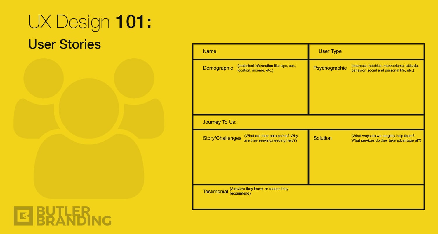
Once we and our clients have agreed to work with one another the next step is a Discovery Session. During discovery the goal is to do everything in our power to take ourselves out of the equation and focus solely on the users. We do this by building User Stories. User stories are broken up into several categories:
Demographic – statistical information such as: age, gender, marital status, location, vocation, income, etc.
Psychographic – personal information such as: personality type, brand affinity, mannerisms, hobbies, likes and dislikes, voice and tone, etc.
Story/Challenges – motivational information such as: pain points, preferences, felt (perceived) needs, unfelt (real) needs, etc.
Solutions – the ways our brand can help alleviate their pain, increase delight, entertain, educate or empower, etc.
User Journey – the path the user has taken from how they initially heard about or found our brand, why they choose to engage with our brand, etc.
User Delight – the end result and feeling the user ideally has after engaging with our brand (why they would return and recommend us to others)
Below is a graphic of how we can visually break down a user story together with our clients. The goal is to learn who our users are, how they think, what they want, what they need and how we can help them. When creating user stories it’s important to use a lot of empathy – try to feel what your users feel.

At Butler we like to do at least 3-4 user stories, and it’s sometimes helpful to do 2 scenarios for the same user: one mapping out the current journey and one mapping out an ideal journey. For example, if a brand’s customer service has been lacking and the goal is to level up, then it would be helpful to map out what a customer is currently experiencing in comparison to what a customer ought to experience if our customer service was on point. This way we can identify gaps in order to improve our users’ experiences.
3) Competitive Audit
A simple way of explaining a competitive audit is essentially looking at what your competition is doing. The goal is not to copy your competition, but rather to gain insights into what may be working, what may not be working, what industry standards (if any) there may be, areas that are missing where you can differentiate yourself, innovate and/or fill gaps, etc. These insights can help you set yourself apart, as well as avoid unnecessarily reinventing the wheel. When doing a competitive audit, I like to look at the market share dominator, as well as the realistic (closer-to-home) competition. For example, a local coffee shop could look at Starbucks (the market share dominator) as well as the other local coffee shops down the road (the realistic competition).
4) Prioritization
A prioritization exercise helps us narrow down and refine a brand’s priorities based on improved brand experiences. During discovery there are typically three areas of prioritization we like to explore:
Revenue – the various products, services and channels that make brand money
Awareness – the different mediums that help spread the word about a brand to more users
Efficiency – the different ways a brand’s products, services and processes can be improved to enhance a user’s experience and a brand’s ability to deliver on user expectations
Since each of these categories may have several items listed, the object of the prioritization exercise is to narrow down which ones to focus on based on urgency (“how soon do we want/need to focus on this?”) and impact (“how will this negatively/positively affect the user’s experience and consequently our brand?”).
5) Requirements List
All of the above steps are discussed in a Discovery Session with our clients in order to generate a UX Requirements List. A requirements list is simply a list of everything that’s required to enhance a user’s experience in whatever is being designed. Requirements lists change from one application to the next, so the goal is to narrow down what is required to maximize the users experience for each application we’re focusing on. A website, for example, may have several items listed in a requirements list while a landing page may only have a few. Items can include things like:
- Brand identification
- Clear navigation
- Clear and concise value proposition
- Value content
- Trust symbols
- Social proof
- Social sharing feature
- Simple and compelling lead capture form
- Etc…
A UX Designer then takes the requirements list and analyses it in light of the Discovery Document in order to create effective Information Architecture.
6) Information Architecture (AI)
Information Architecture is the process of labeling, compiling, and arranging all of the elements that a design will incorporate. A wireframe is the most basic form of information architecture. A wireframe is basically a page schematic (or blueprint) of a design. I often start wireframes on a whiteboard since it’s easy to erase and make changes on the fly while thinking about a desired layout. I may have 2-4 different whiteboard wireframes that I transfer to a sketch book. My sketch book acts as my UX Journal where I compile all my notes and thoughts.
Sometimes, if necessary, we’ll convert the sketchbook wireframe into a more professional blueprint in Photoshop or Illustrator in order to send to the client for approval and collaboration. You can also use awesome wireframe software like Balsamiq.
Once you complete all of the above steps, you can confidently say you have a UX Design Strategy. This strategy acts as the foundation and structure for the design. You can now give this carefully crafted strategy to a designer who will put the final aesthetic touches on it. This process is what sets a designer apart from a strategist.


