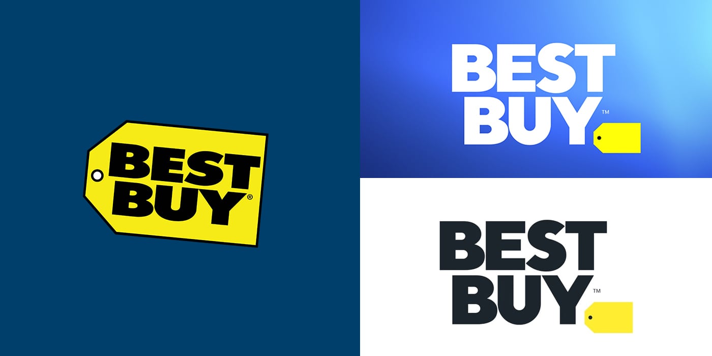
So, what do you think of the new Best Buy logo redesign?
When a company with the size and reach of Best Buy updates its logo, it’s like feeding season for the design community and haters everywhere. Everyone jumps in and shares their subjective opinions about the new look.
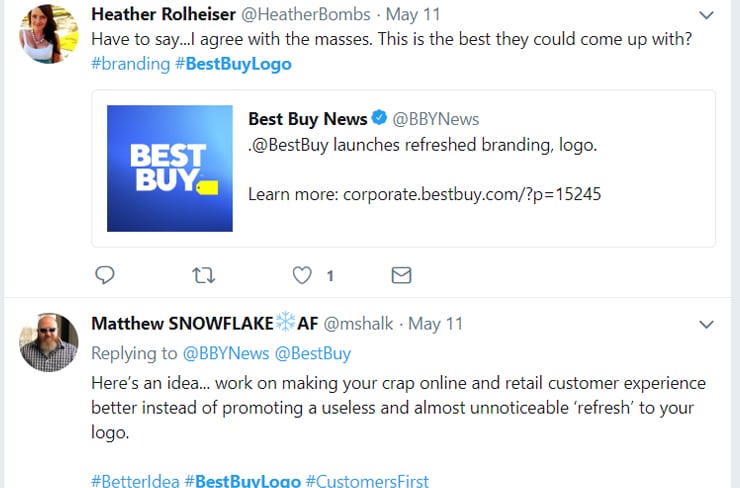
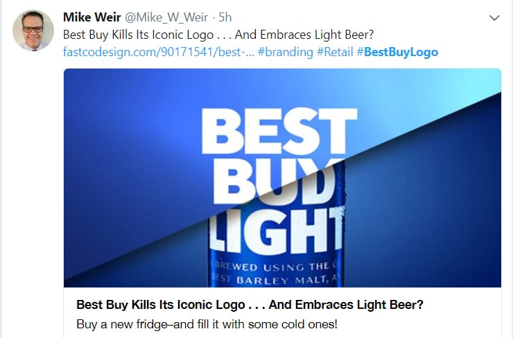
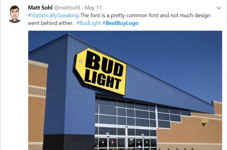
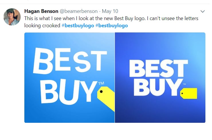
And some people have a little too much fun…
As with anything in life – haters gonna hate… What I think is interesting from the design community, though, is the arguments are almost always typically about the aesthetic:
- “doesn’t look like much”
- “is that the best they could come up with?”
- “they spent way too much money on something that simple”
- “give me your money! I could have done something way better”
Why The Change
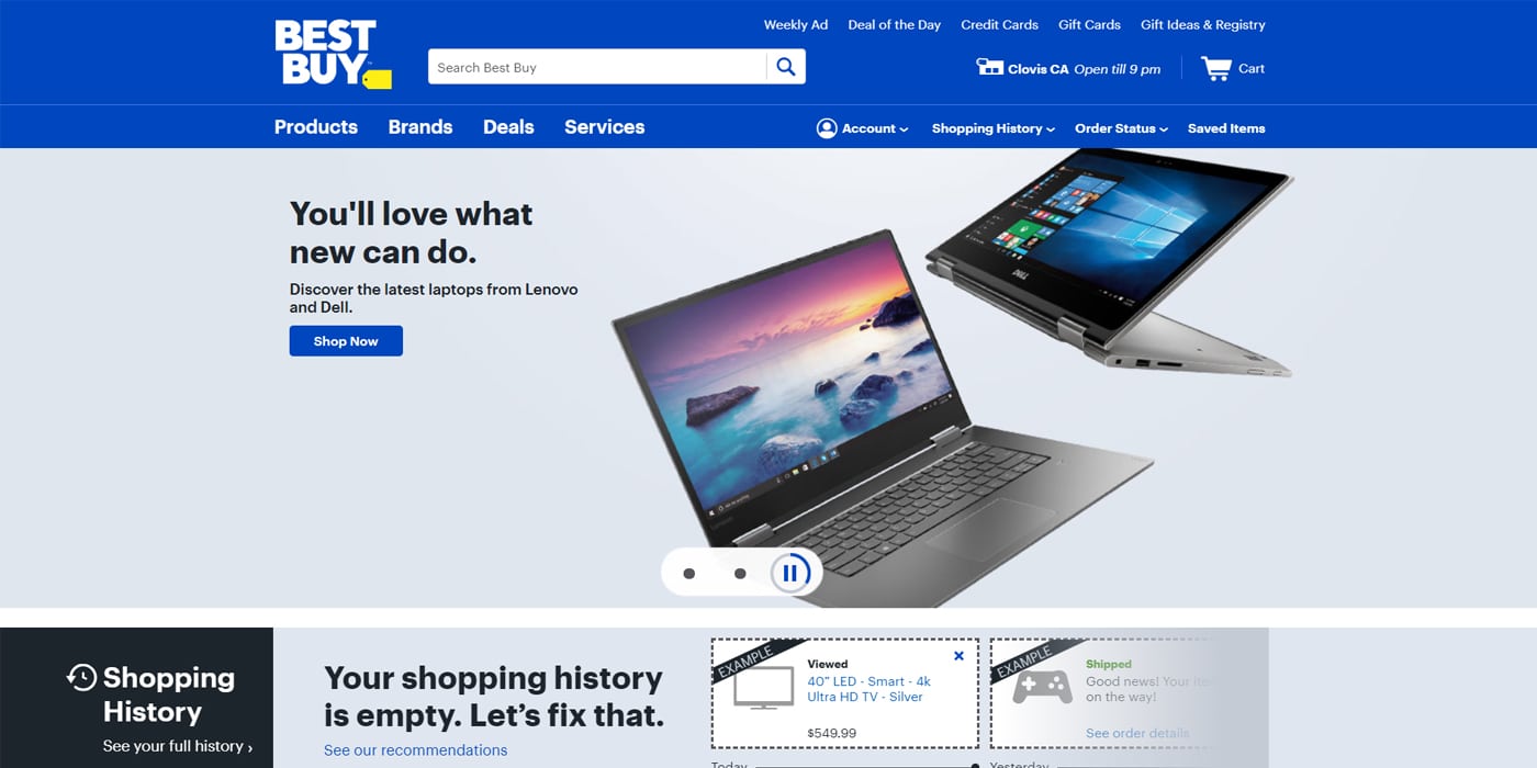
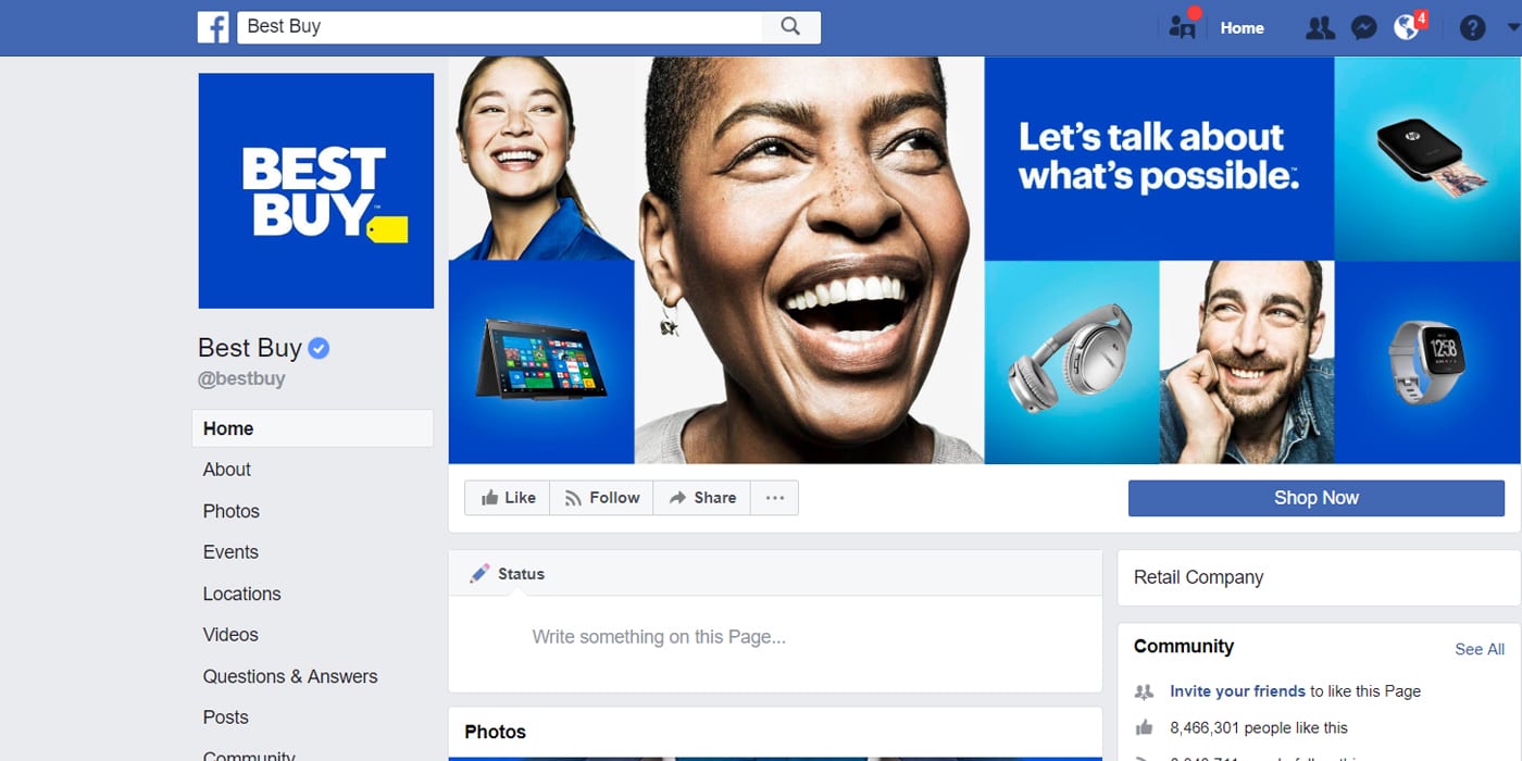
It’s as if people think companies like Best Buy invest hundreds of thousands of dollars on rebranding campaigns simply because of vanity and aesthetics. As with any brand refresh, the Best Buy update impacts more than just their logo. The campaign also includes updates to the company’s website, social media accounts, uniforms, store signage, shopping bags, and a whole-new set of ads that will be debuting May 13, 2018. You would think that with an investment of this size (especially with a company like Best Buy whose brick and mortar industry has been in a downward spiral for some time) there would be deeper reasons for a rebrand than “we were just kinda tired of the old logo”.
So what does the company have to say about the redesign?
“The updated logo is true to our heritage, but it’s really cleaned up…It’s an evolution toward the future, and we’re really excited about that.”
Best Buy Chief Marketing Officer Whit Alexander
Wait… “an evolution towards the future”? Really? What does that even mean? An article from The Verge, I think, has it right even from the title: “New Best Buy logo diminishes the shopping tag because brick-and-mortar stores are dead”.
A Change In Symbol is a Symbol of Change
Yes, from a design standpoint the redesign isn’t that impressive.
- Focus on the wordmark apart from the icon
- Change the chubby sans-serif font to look sleeker
- Remove some strokes
- Change up the blue, making it feel more alive than dull
One might be quick to say “I could have done something better than that”. But the point of design is not just about the aesthetics. Is it that they’re trying to communicate “we’re thinking outside of the tag” (a separation from the brick and mortar concept we’ve traditionally known)? Maybe – but more importantly the redesign communicates “we are changing”. According to Best Buy the new logo is “designed to highlight our culture, our expertise and our talented employees…”
Because E-Commerce has disrupted the brick and mortar industry, retailers like Best Buy need to adapt and evolve if they want to survive. As consumers we now know that “Best Buy” doesn’t mean “Best Price”. So if Best Buy wants to survive, they need to position their brand as something more than a destination to buy electronics at a good price. A focus on highlighting “our culture, our expertise and our talented employees” positions the brand as a destination for a culture of expertise in electronics – something you can’t get from an e-commerce store.
The Strategy that Guides Design
When a brand repositions itself in the market it’s important to communicate the change to the public. Design is one of the most effective ways of doing this. When strategizing how to redesign or refresh a logo like Best Buy’s, agencies need to consider things like:
- What is the purpose of the redesign?
- How far can we safely stray from the original?
- What are the different applications the logo will go on?
- How can this logo vary based on the different applications?
- What brand/user experiences will be affected by this design?
- What is appropriate for the end-result we’re aiming for?
- And yes – does the new design “look good”?
No, we weren’t in the strategy sessions that guided the redesign of the Best Buy logo. However, I think it’s safe to assume that all of these questions (and more) were considered, and dozens of explorations were brought forward before landing on what we now have as the new Best Buy logo.
So back to the original question – what do you think of the new Best Buy logo redesign? Whether you love, hate or are indifferent toward it, let your answer be deeper than “I think (or don’t think) it looks good”.


