Care Centered on You
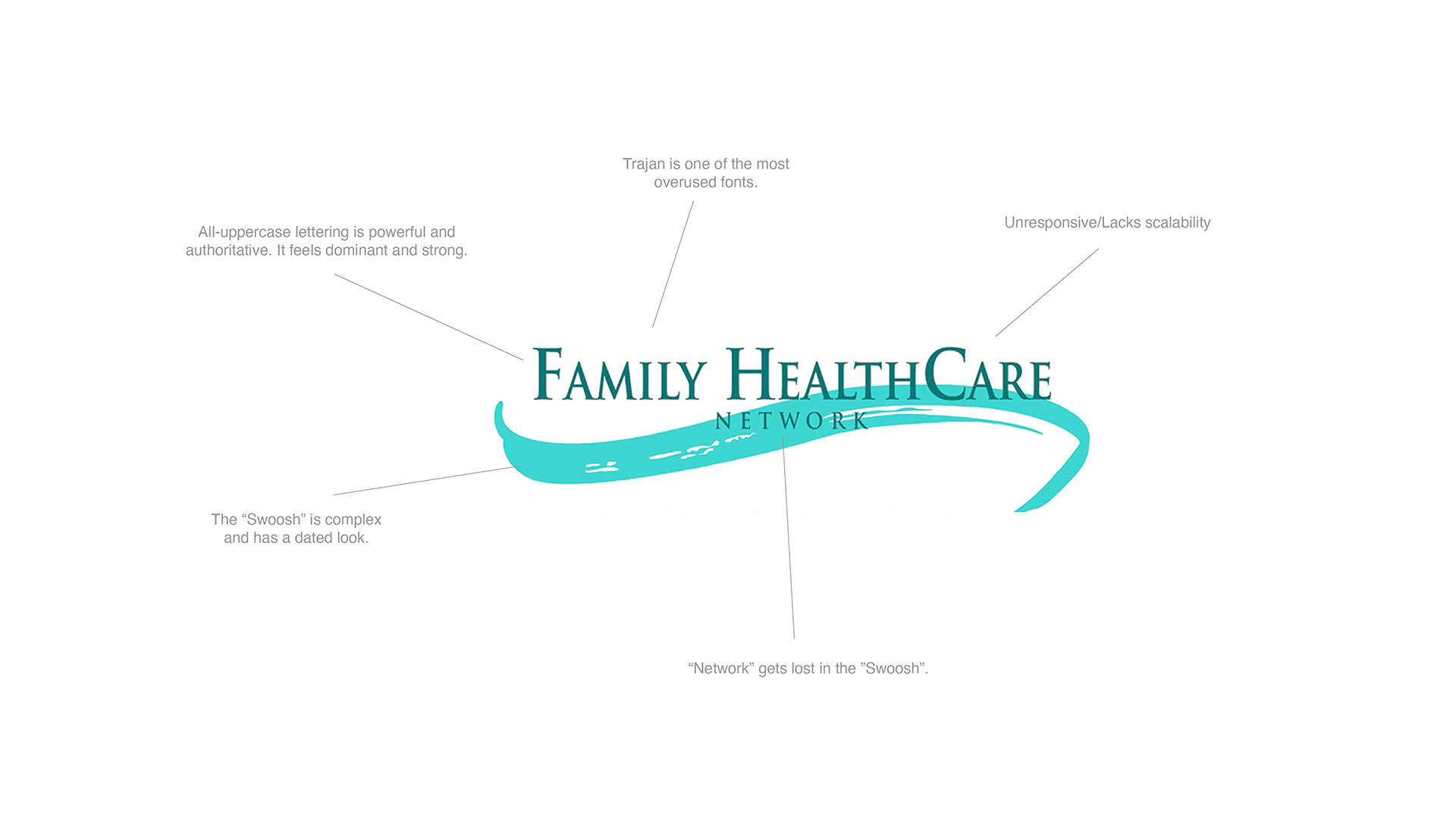
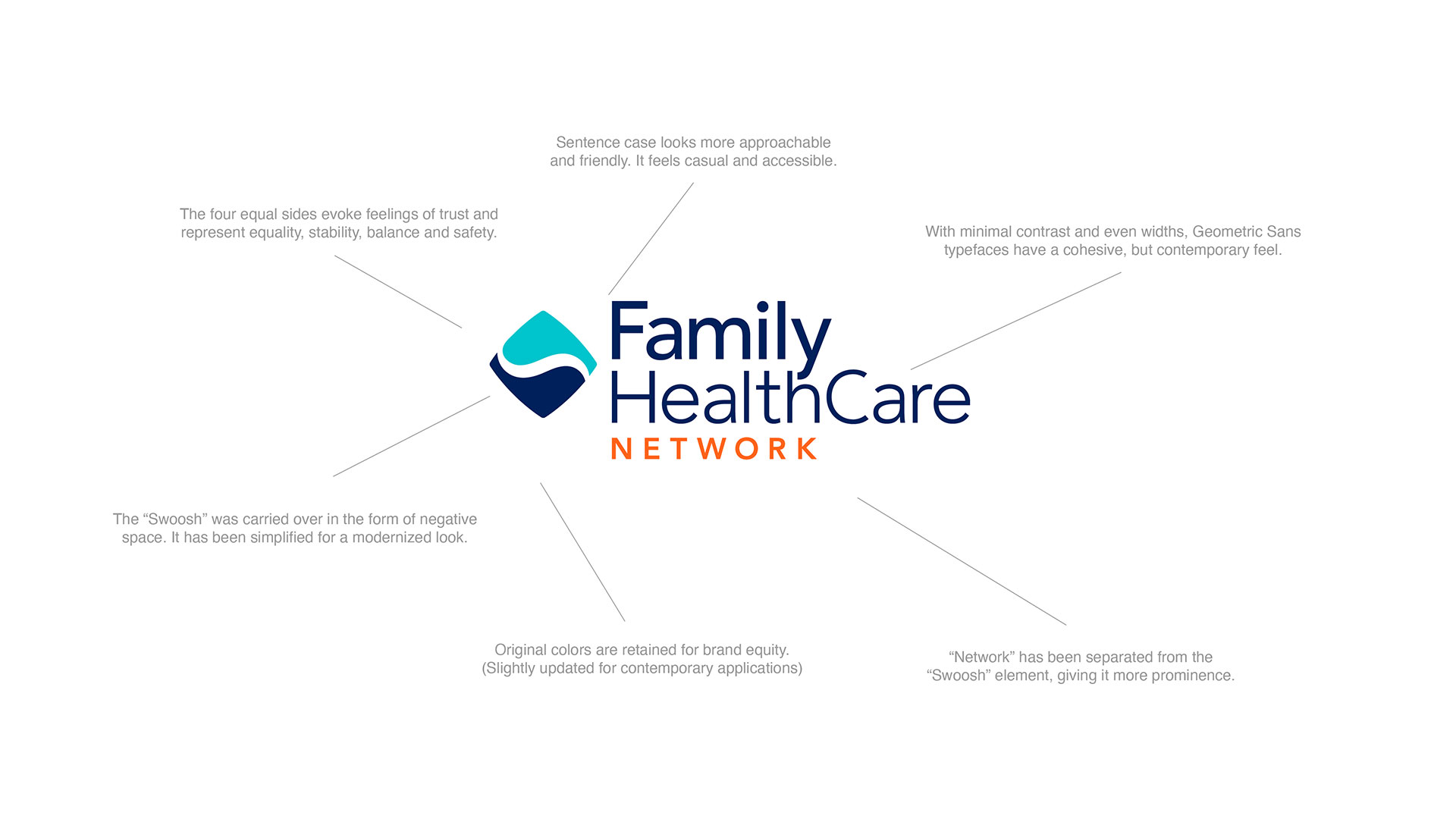
Butler Branding guided FHCN through the rebranding process which included a redesigned logo as a representation of an evolution of their previous logo. The redesigned logo has four equal sides that represent equality, stability, balance, safety.
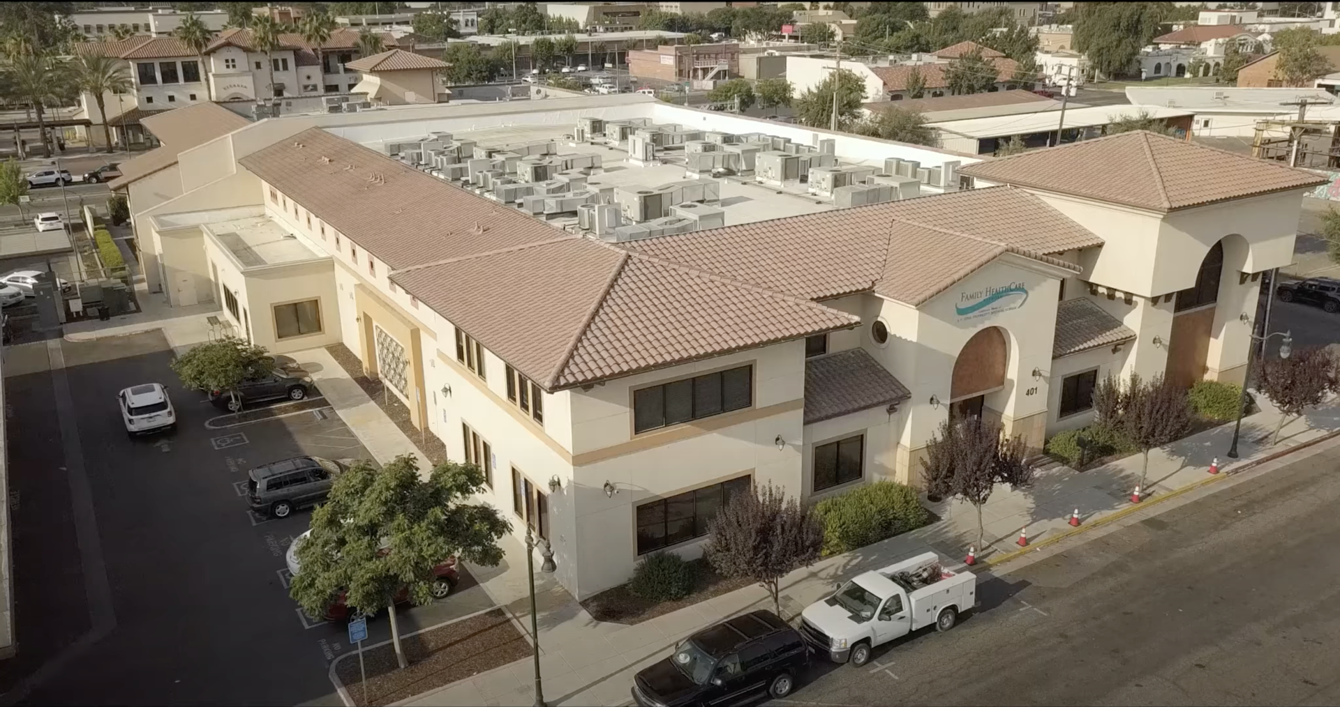
Having 45 locations and counting with over 1,500 employees, Family Healthcare Network is one of Central California’s largest Federally Qualified Health Centers (FQHC). However, FHCN has very humble beginnings – starting out of an abandoned gas station. Much has changed over the years as the organization grew and became more sophisticated. The growth and evolution of the organization demanded an evolution of the brand.
Responsive Logo Lockup Variations

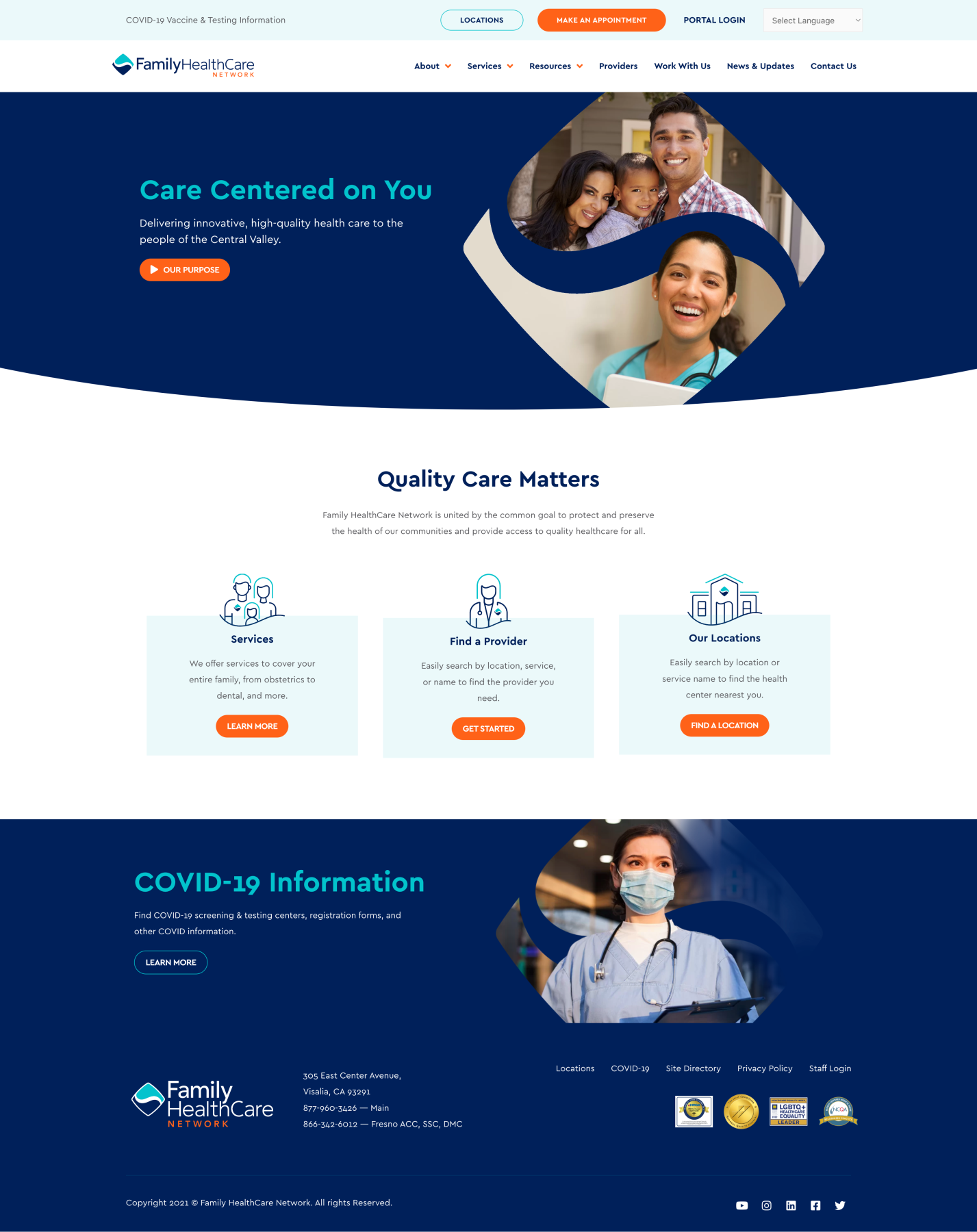
This comprehensive rebrand included brand strategy, logo design, brand identity, website design, video production, photography, brand messaging, and a refresh of all FHCN’s branded material.

