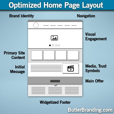
When designing your website, you have to start with a strategy. You don’t want to just throw up a bunch of information about your company just for the sake of it. Every piece of content, whether it be pictures, text or video, should serve a purpose, and the layout of that content should serve a purpose as well. For more information on planning your website strategy, see our article on “What Makes A Successful Website”. No matter what purpose your website is designed to serve, one of the purposes should be to design the website to be Search Engine Optimized.
After you plan out how many pages should go on your website, and what content should go on each page, then it comes time to designing each page (figuring out how to lay out that content). The very first page to design is the Home Page. So the question is, “how do I design my Home Page to be Search Engine Optimized”? Think of the Home Page of your website as the directory. The Home Page Design should help your visitors easily find the content they are looking for, or the content you are trying to funnel them to. If people can’t find the content they are looking for within a few seconds or a few clicks, then they are gone to a competitor. Below is a standard home page design layout for optimal SEO.
In this example, it shows 8 items that are commonly found on many Home Page designs of some of the best modern websites. You are not limited to just these 8, nor do you have to use all 8 elements. This is just an example. The 8 elements are:
Brand Identity
This is typically your logo, or site title
Navigation
Your websites navigation should be simple and self explanatory. Keep in mind that you are designing your website for your visitors, not for you. Stay away from a confusing page navigation menu.
Visual Engagement
No one likes to be inundated with text as soon as they go to a website, so keep the first thing that your visitors see simple. Visual engagement could be a big picture or video explaining who you are and what you do. Some text isn’t bad, but keep it under a paragraph.
Primary Site Content
After your visitors know who you are and what you do by looking at your visual engagement, then it comes time to direct them to some of the primary content you are featuring on your website. Whether it’s information you think they are looking for, or information you want them to see, you should make it easy for them to go there by having some clear Call To Action boxes, tiles or buttons.
Initial Message
Your initial message could be a welcome message, or a brief explanation about what your visitors can expect when working with your or browsing through your site. Keep it simple, to the point, and easy to read. Incorporating bullet points with links out to more information is helpful.
Media or Trust Symbols
Media can be anything from a small gallery or slider, to a video or picture. This is just a visual giving your visitors a little more information about you, without pages full of text. Symbols of trust are usually logos or emblems representing: clients you are trusted with, partners you are affiliated with, or organizations you are accredited with. This gives your visitors trust that you are competent to do what you say you can do.
Main Offer
Don’t leave your customers hanging! Always have a clear call to action linking to the main offer of your website. Whether it’s giving away a free resource, or having them contact you for more information, make it clear and simple for them.
Again, keep in mind that this is just a guide. You don’t have to stick to this exact Home Page Design layout, and by all means use artistic freedom. However, make sure you aren’t so unique that visitors get lost and don’t know what to do or where to go on your website.
Some additional elements that one may want to include in their Home Page design can be:
Recent Blog Posts
Recent Work (Portfolio items)
Mini Gallery (Showing some pictures related to the website’s content)


