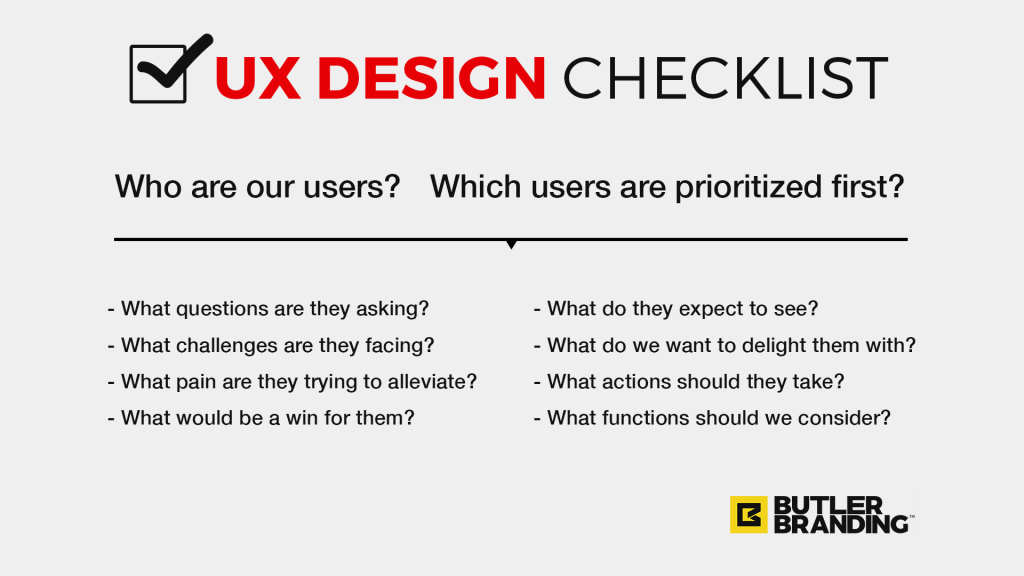
Hopefully by now you already know what UX Design is. If not, read our first UX Design 101 post. The simplest way of defining UX Design is designing with your users in mind. Get yourself out of the picture and focus solely on the people you are seeking to serve. When running Discovery SessionsThe kickoff meeting we facilitate before designing anything in order to develop a solid design strategy. one of the key exercises we conduct is User Profiles. This is where we really focus on the audience we are designing for. Below are 10 questions we like to ask during this exercise.
*Note: It’s helpful to conduct this exercise on a whiteboard with a team, allowing everyone the opportunity to chime in and offer input. This exercise can be used for several different applications, but for the sake of clarity and brevity I’m going to pretend we’re conducting this exercise to improve user experience for a website.
1. Who are our users?
This seems like a no-brainer, but it’s critical to actually ask the question. We’ve found that many people are surprised to realize that their website should not appeal to just one type of user. Many e-commerce businesses, for example, tend to only focus on new prospective customers – those who have just heard about the brand and are visiting the website for the first or second time.
However, what about the loyal customer? What about existing vendors/partners? What about prospective vendors/partners? What about people seeking employment? What about affiliates? What about site admins and employees? The list can go on. It’s good to think about all the possible users who would be visiting your website, and list them all on the board.
2. Which users are prioritized first?
 A key aspect of developing a solid UX Strategy is prioritization. We need to do this right from the outset. Though it’s important to list all the possible users of your website, it’s even more important to know who the website should be primarily designed for. You can’t possibly appeal with equal effectiveness to everyone simultaneously. Designate who the primary and secondary user are. Then users of third and fourth importance, so-on and so-forth.
*Note: Questions 7-10 deal with content, features and functions that should be included in the website requirements list. These, too, should be prioritized. Ask all questions for all users, then prioritize content, features and functions for each user. This will result in a prioritized website requirements list organized in order of importance.
3. What questions are they asking?
Now that we’ve identified who our users are and prioritized them in order of importance, it’s time to get into their mindset. Unless you have actual data you’re going to have to use a little imagination, empathy, and common sense. In order to think about the questions they’re asking, you need to put yourself in their shoes. Who are they? What is their knowledge level of your products and services? What is their felt need? What would they Google if they were looking for your type of company? Once you’ve considered these questions, make a list of questions they’re likely going to want answered upon entering your site. Another way to come up with a quick list of questions is to think of the 5-10 questions you’ve answered 100 times.
*Note: Nothing beats real, hard data. If you don’t have this information for your actual users, then start compiling it by simply asking. User satisfaction surveys are a simple, effective way to get real information.
4. What challenges are they facing?
The essence of UX Design is to make your users the hero, not your brand. Your brand is a means to their end. They are trying to accomplish something in life, whether at work or at home or in their personal time, and something is getting in the way of that. That’s the challenge they’re hoping you can help them overcome. What are those challenges? Make a list of everything you can think of.
*Note: It’s helpful to use sticky notes. Put one challenge per sticky note, then put all them all on the board. Move them around as you prioritize what challenges are most important for each user.
5. What pain are they trying to alleviate?
Not only do your users have challenges, but those challenges are causing pain in some aspect of their life. Many challenges cause pain in multiple facets. For example, a challenge might be that Sally’s wardrobe is old. The pain that this challenge is causing Sally is that she feels self-conscious, sporting the same wardrobe for the last two years. Another pain point might be that her current wardrobe is too hot for the new season. Understanding your users challenges helps you identify the featuresThe tangible product/service – what they actually get. they need, but understanding their pain helps you identify the benefitThe advantage they get from using your products/services. they long for.
*Note: Identifying challenges and pain points helps you uncover the features and benefits your users care most about. This directly relates to UX Design as you will now know what content to prioritize above other items.
6. What would be a win for them?
Now that you’ve identified your users’ challenges and pain points, consequently uncovering the features and benefits that you should lead with, it’s time to think about what sets you apart from the other brands offering the same products or services that you do. Asking “what would be a win for my users?” helps you differentiate your brand as one who cares about delighting, rather than just fulfilling a task… Not just meeting their needs, but going above and beyond. This might be perks like free shipping, or subtle high-touch gestures like a personalized notes. A good way to think about what would be a win for your users is to ask these two questions:
- What is everyone in my industry doing?
- What is no one in my industry doing?
If everyone is saying “we have the highest quality______”, then it might not have that great of an effect if you repeat it. However, if you notice gaps in the market see them as opportunities to help your users win.
*Note: Identifying challenges and pain points helps you uncover the features and benefits your users care most about. This directly relates to UX Design as you will now know what content to prioritize above other items.
7. What do they expect to see?
The last few questions dealt primarily with content and messaging, but now we need to start thinking of functionality and layout. When a user lands on your website homepage, for example, what do they expect to see? There are some universal items that are applicable to every website. Every website only has about 3-5 seconds to grab a visitor’s attention, tell them who you are, what you do, how it makes their life better, and how they can get it. For more on this, see our video answering “What Content Should Go On My Website“.
However, there are some things that are specific to your products, services, industry, or type of website that you need to consider when it comes to your design. If you’re designing a website for a real estate company, visitors (who may include prospective home buyers) may expect to see available listings in your area. If you’re designing a site that sells shoes, visitors may expect to see different color samples, or maybe customer reviews. Make a list of all the things that each user would expect to see if they visit your website.
8. What do we want to delight them with?
This is closely related to question 6 (What would be a win for them?), but more specifically geared towards website functionality. Going back to the real estate website example, users may expect to see available listings in your area, but we’re going to delight them with a virtual tour and video walk-through of each featured listing. Users of an online shoe store may expect to see different color samples and customer reviews, but we can delight them with a filter option that allows them to search by best rated, or specific colors.
*Note: Make a list of all the ways you could delight your users, with one idea per sticky note. Put them all on the board vertically, and reposition them as you prioritize which ideas are most impactful for each user.
9. What actions should they take?
The Call-To-Action is one of the most vital elements of any design. Often times its better to start with determining the action first, then the content to support that action. What do you want your users to actually do? What is the logical next step? How do they take advantage of whatever it is you’re offering? Should they call, make a purchase, fill out an inquiry form, join your newsletter, follow you on social media, download a guide, leave a review, sign up for a free trial, create an account, etc.? Often times there are several actions a user could take. Prioritize the actions in order of most important, then make the call to action clear and obvious. It’s also helpful to display the process they would follow after the initial call to action. For example “Fill out the below request form and an account executive will contact you within 1 business day.”
10. What functions should we consider?
The reason I put this one last is because by now you should already have a pretty exhaustive list of functions you will need for your design. The way I might phrase this question during Discovery might go something like, “considering everything we just discussed, are their any other features or functions we should consider for this design.” Surprisingly, I almost always get a few different items that were left out. These can be things like links to affiliate sites or third party software, or specialized social engagement.

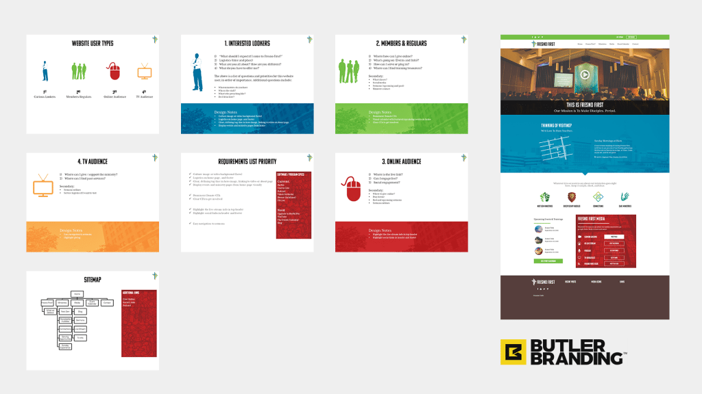
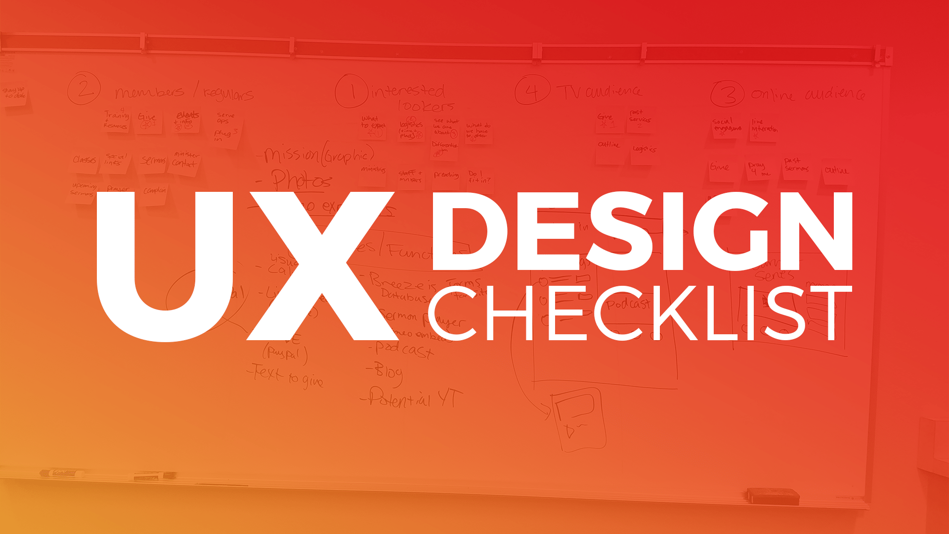
Below are a few images from a live Discovery Session I held with a local church that was undergoing a rebrand. We followed this exact format for User Profiles. We started with the whiteboard, then compiled all the notes into an organized slide deck, which helped us produce a requirements list, site map, and initial design concepts.


