Every business’s website needs a refresh now and then – even a web design agency’s. As we learn more about what connects with our prospective clients, and how to lead them on the path toward partnering with us, we’re constantly refining our messaging, tweaking our design, and making it easier for visitors to TAKE ACTION after they find us.
But recently, we made some website changes that go beyond simple adjustments. We overhauled our homepage to read, look, and feel incredibly different … while actually retaining a lot of its previous structure.
Why would we take the time to make a set of changes like this, which you might not even notice unless you’re us? Well, like we tell our clients, it’s all about brand positioning. And we had unknowingly succumbed to one of the fatal flaws that tempts all brands: Getting too wrapped up in your own story.
Donald Miller Was the Spark That Started the Redesign Fire
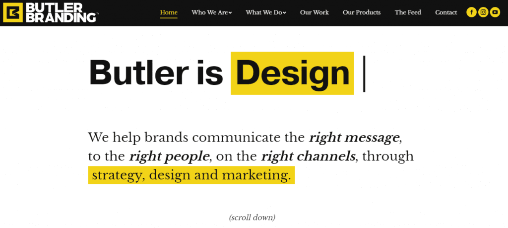
True fact: I’ve wanted to update Butler’s homepage since starting here in October of last year. While our old homepage conveyed our creativity, work ethic, and collaborative spirit effectively, it did so by talking about US a lot. Three of our first four pieces of copy defined what Butler is, instead of speaking to our prospective clients’ needs and desires.

In the world of the 15 Second Rule (you have less than 15 seconds to convince someone to stay on your website – at that point, they often bounce), talking about yourself for so long is a death sentence. Even if your story is interesting, prospective clients usually don’t want to hear it. They just want to hear how you can solve their problem(s).
While I’ve wanted to overhaul our messaging to more directly speak to our clients’ needs for awhile, it took a recent team viewing of Donald Miller’s 5 Minute Marketing Makeover videos to convince me to pull the trigger. Miller talked about the “wrapped up in your own story” fallacy that I’d been meaning to help us dodge, as well as a number of other design elements that I knew we could take advantage of.
Applying the StoryBrand Approach to Our Homepage
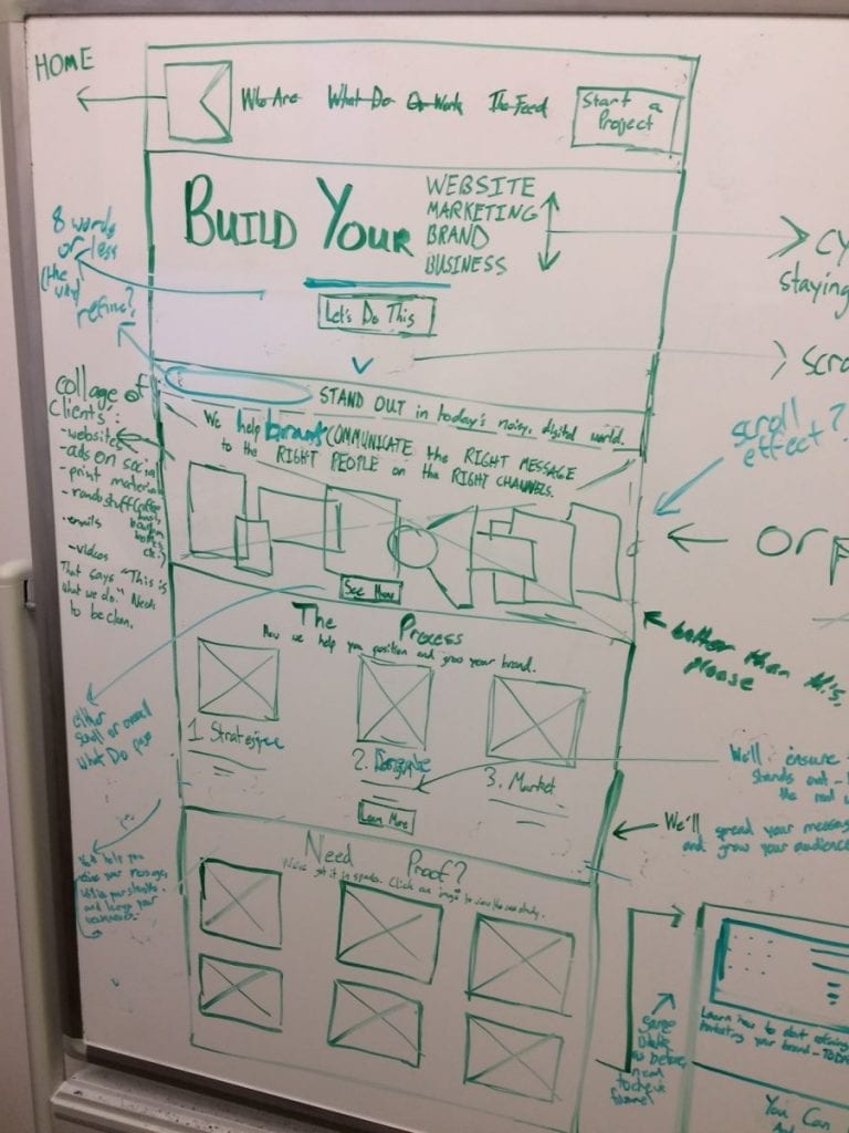
So how did we actually go about applying Donald Miller’s StoryBrand framework to our homepage? It started not with that updated messaging I keep harping on, but with a whiteboard drawing:

That drawing might look like a mess (listen, I was hired to write words), but it’s the start of a homepage that speaks directly to prospective clients – and makes it EASY for them to decide to partner with us.
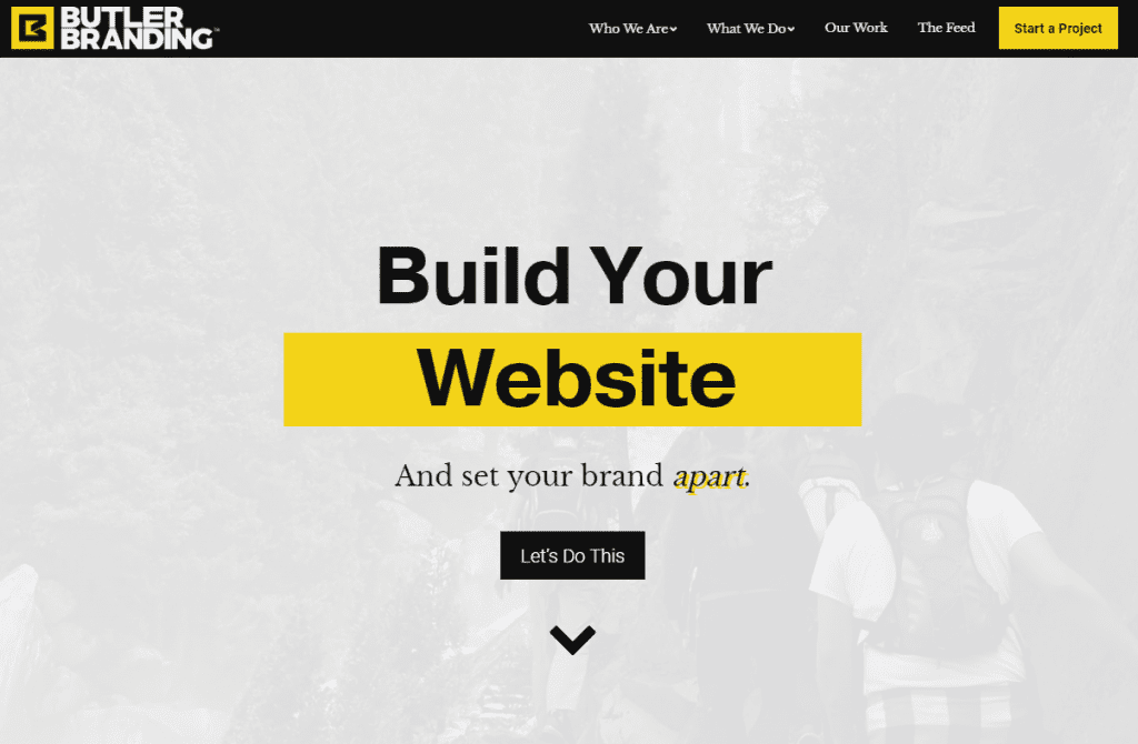
To start, our webmaster and I decided to eliminate a couple items from our navigation menu, and change our previously nondescript “Contact” link into a bold “Start a Project” button. If your eye was drawn directly to the yellow rectangle at the top, right-hand side of this page before you started reading this post, that happened by design. In most cases, we want prospective clients to do one thing when they land on a Butler Branding web page – start a project with us. We’ve now made it much easier (and more likely) for them to do so.

From there, I began revamping the words we use to talk to clients, and adding additional sections (like our new Process section) and design elements to convey Butler’s value. Instead of talking about ourselves, I strove to speak to our clients’ needs and desires, using as few words as possible.
I also looked for places we could show our work (using either video or graphics) and guide clients through the journey they’d go on if they chose to work with us. While prospective clients might not get as robust a sense of Butler Branding’s culture from this version of our homepage, they’ll definitely get a fuller sense of how we’ve served other brands – and how we can solve the same problems for their business.
But lest I sound like a pretentious jerk who came in and somehow had all the right answers for how we should re-do our homepage, I want to stress how collaborative this refresh process actually was. While I provided the initial wireframe, I bounced my ideas off our marketing director and webmaster as I drew (the picture above is version 2.1, actually). A pre-development review session with our CEO ensured that we spoke to prospective clients’ feelings, rather than just their tangential desires, in our all-important hero section. And while I wrote the words “And set your brand apart,” it was our webmaster who suggested that we could do something to convey that feeling visually, using those words.

So What Were the Results?
Hopefully, the theory behind our recent homepage redesign makes sense. And if you click over to our new version homepage, you can see the full bevy of client-centric updates in action.
But in marketing, results are more important than theory. Which means, in order for this redesign to be successful, we need to start seeing more homepage traffic, longer homepage page views, more button clicks, and more submissions.
While it’s too early to call our homepage redesign a rousing success (the revamped page launched about 20 days ago at the time of this writing), I can tell you that – anecdotally – we’ve seen increased web traffic in July and received more form submissions for the free eBook that we offer near the bottom of our homepage. That means more people are coming to our homepage, scrolling far enough to see the next-to-last section of it, and offering us their contact information – which feels like a win.
We’ve already begun applying the lessons learned during this process to the work we do for our clients (and we’ve found that, in most cases, we were already better at conveying our clients’ value than our own). I’d like to think that, in the process of building a better Butler Branding homepage, we also built a better Butler Branding – one that’s more cognizant of how we optimize on-boarding not just for our clients, but our clients’ clients.


